
You see your packaging design on screen.
The colors are bright, clean, and exactly what you imagined.
Then the printed box or bag arrives… and the color looks dull, dirty, or just “wrong.”
Most of the time, this is not only a printing quality issue.
It is a color system issue: CMYK vs Pantone vs what you see on your screen (RGB).
This guide walks you through the basics you should know before you send any packaging artwork to print, especially for custom paper boxes, bags, and cards.
Why Printing Colors Matter So Much for Packaging
Packaging is often the first physical touchpoint between your brand and your customer.
- The color of the box, handle, or logo sets the mood.
- Consistent brand colors help customers recognise you quickly.
- Poor or unstable color makes the whole product feel low-quality, even if the product itself is good.
In packaging projects, color problems usually come from:
- Using RGB (screen color) files for print
- Not understanding the difference between CMYK and Pantone spot colors
- Skipping proofs or not talking about color with the printer early enough
Once you understand how printing colors work, you can brief your designer and your packaging supplier with confidence and avoid expensive reprints.
Screen Colors vs Print Colors – RGB, CMYK and Pantone at a Glance
RGB – Why Your Screen Looks Brighter Than Your Box
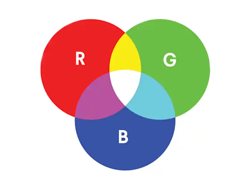
Your computer, phone, and TV all use RGB color.
- R = Red
- G = Green
- B = Blue
These are light colors. When RGB values mix on a screen, light is added, so the color range is very wide and often very bright. Neon-like colors, intense blues, and glowing greens are easy to display on a screen.
But printing does not use light. It uses ink on paper. That is why the printed result will almost always look a bit darker and less “glowy” than the screen.
If you approve your packaging color only based on what you see on a monitor, you are almost guaranteed to be disappointed later.
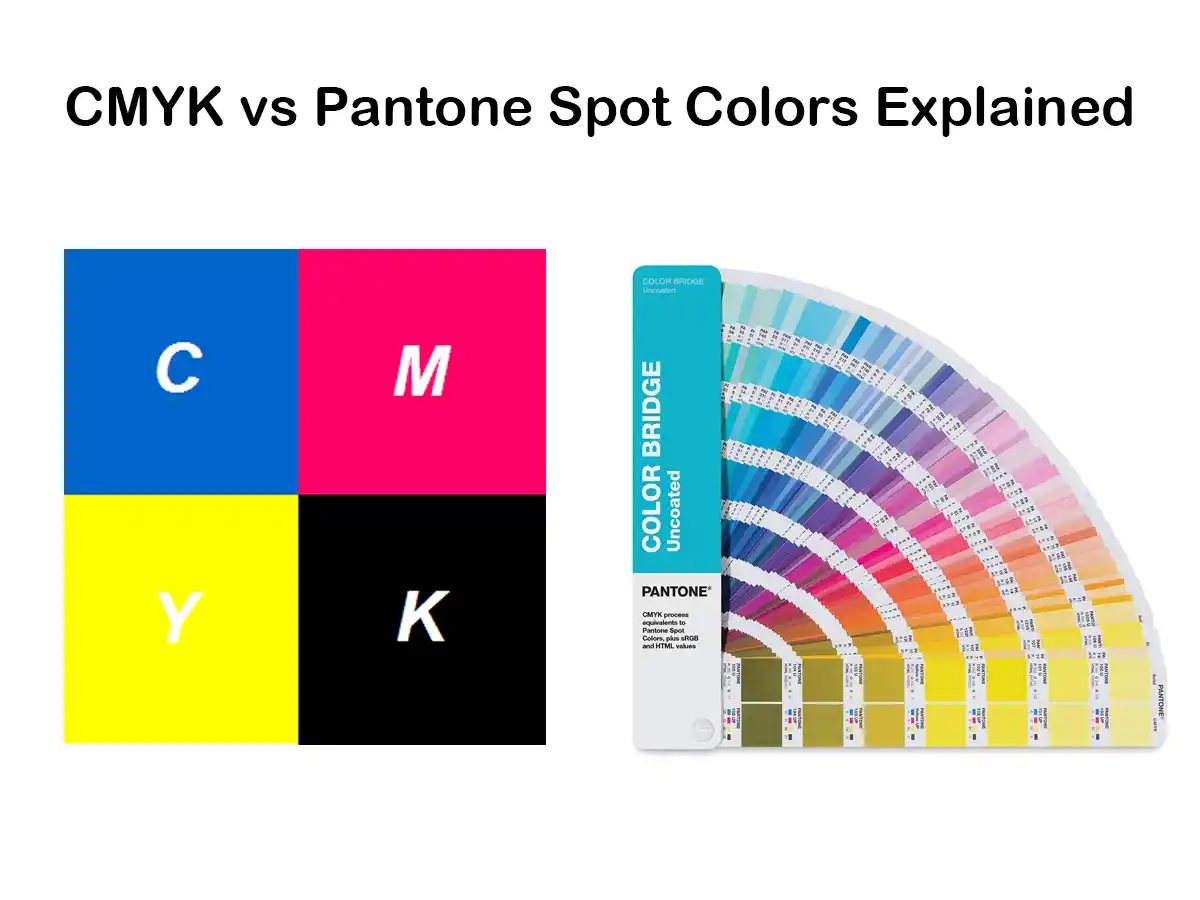
CMYK – The Standard Color Model for Printing
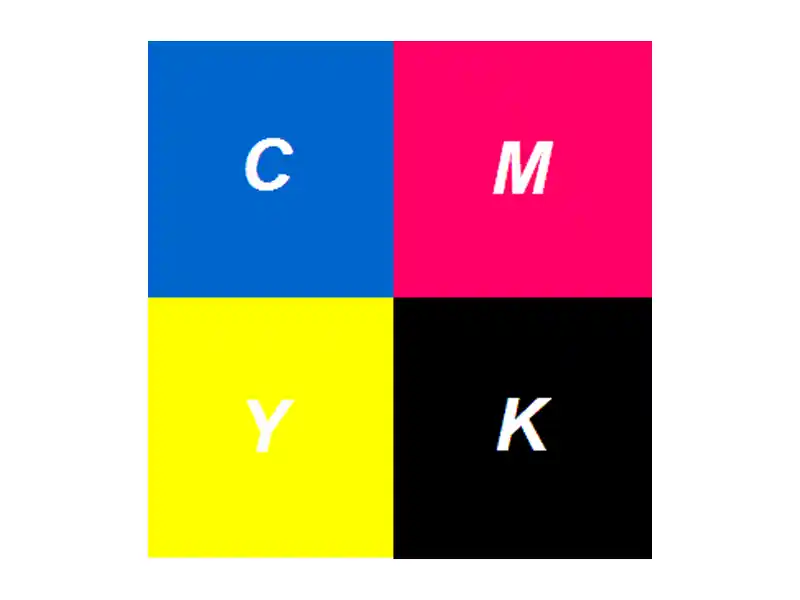
Most paper packaging is printed in CMYK:
- C = Cyan
- M = Magenta
- Y = Yellow
- K = Key (black)
CMYK is a subtractive color model. In simple words:
- The paper reflects light.
- Inks on the paper absorb part of that light.
- What your eyes see is the light that is not absorbed.
Tiny dots of C, M, Y, and K are printed in different amounts. Your eye blends these dots into full images and colors on your box or bag.
Pantone / Spot Color – Pre-Mixed “Recipe” Inks
A spot color is a pre-mixed ink with a specific formula. It is not built from CMYK dots during printing. It is mixed in advance, like following a paint recipe.
Pantone is the best-known spot color system. Each Pantone color has a unique code, for example:
- Pantone 186 C
- Pantone 877 C (a silver metallic)
Designers can choose a color from a Pantone guide, and printers can mix the same formula in different countries and on different presses. This is why Pantone is widely used for brand colors and logos.
What Is CMYK Printing and How Does It Work?
How CMYK Builds Color on Paper
In standard offset or digital printing, your packaging artwork is separated into four plates or channels:
- Cyan
- Magenta
- Yellow
- Black (Key)
Each plate prints tiny dots of its own color. When you look at a printed box closely, you may see these dots. From a normal viewing distance, your eyes mix them into images and solid colors.
CMYK is ideal when your packaging includes:
- Product photos
- Gradients and smooth shadows
- Complex illustrations
- Many different colors on one design
One CMYK setup can cover all of this in a single print run.
Why There Is a Separate “K” for Black
In theory, if you print 100% cyan, 100% magenta, and 100% yellow on top of each other, you should get black.
In practice, you get a muddy dark brown or very dirty gray, not a clean, deep black. It also uses a lot of ink and takes longer to dry.
This is why printing uses a separate black ink:
- It gives a clean, neutral black.
- It adds contrast and detail.
- It reduces ink consumption.
The black plate is called the Key plate. It often carries the sharp detail: text outlines, small shapes, and key edges of images.
Standard Black vs Rich Black in Packaging
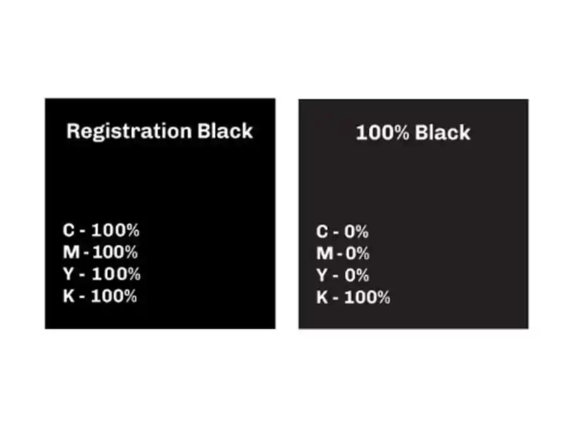
In packaging files, you will hear about two types of black:
- Rich black (a CMYK mix)
- Standard black (100K)
Standard black (100K only) is:
- 0% C, 0% M, 0% Y, 100% K
- Used for small text, barcodes, and fine lines
- Safer for registration (alignment) on press, so text edges are crisp and readable
Rich black is a deeper black created by mixing black with some C, M, and sometimes Y, for example:
- C40 M40 Y40 K100 (just one example – exact values depend on printer and material)
Rich black is often used for:
- Large black backgrounds on boxes
- Big solid areas inside or outside of mailer boxes
- Areas where you want a dense, “luxury” black
However, rich black is not good for small text. If the plates do not align perfectly, letters can look blurry or have color halos. For small type, keep it simple: 100% K only.
Pros and Cons of CMYK Printing for Packaging
Advantages of CMYK:
- Perfect for designs with many colors or photos
- Standard process on almost all commercial presses
- Cost-effective for full-color artwork
- Easy to change designs frequently (seasonal prints, campaigns)
Limitations of CMYK:
- Color range is smaller than RGB and some Pantone spot colors
- Very bright or neon colors are not possible
- Some brand colors cannot be matched exactly
- Color can change slightly between different papers, coatings, and presses
For many everyday packaging projects, CMYK is enough. But when brand color is very strict, Pantone spot colors become important.
What Is Pantone / Spot Color Printing?
How Spot Color Printing Works
With spot color printing, each special color is:
- Pre-mixed as a separate ink
- Printed with its own plate or unit on the machine
For example, your printing setup might be:
- CMYK (4 colors)
- Plus one Pantone spot color for the logo
Total = 5 colors / plates.
Or, if you only have a simple design, you might print only in Pantone spot colors (no CMYK at all), such as two solid brand colors on a kraft paper bag.
Each extra spot color means:
- Additional ink
- Additional plate or unit
- Extra setup time
So the cost per job increases with the number of spot colors.
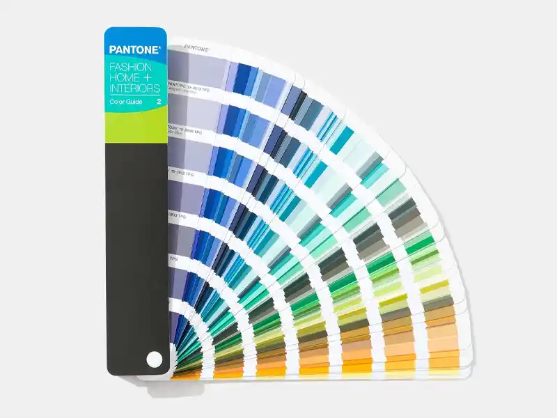
The Pantone Matching System (PMS)
The Pantone Matching System is a standardized system:
- Each Pantone color has a unique number and letter.
- Designers choose the color from a printed Pantone guide (not only on screen).
- Printers mix that ink according to the formula.
This allows you to ask:
“Please print my logo in Pantone 286 C on all my boxes, bags, and cards.”
and expect a similar color result across different orders and even different printing plants (within reasonable tolerance).
This is why Pantone spot colors are widely used for:
- Brand logos
- Corporate identity elements
- Key accent colors on premium packaging
Metallic and Fluorescent Spot Colors
Some special inks cannot be reproduced by CMYK at all. These are usually spot colors:
Metallic inks
- Contain metallic particles (for example, aluminum in silver)
- Reflect light and create a shiny effect
- Examples: gold, silver, bronze, copper
- Often used on high-end boxes, cosmetic packaging, or gift cards
Note: metallic ink is not the same as hot stamping foil. Metallic ink is printed like normal ink and usually looks softer and more “ink-like” than foil. Foil stamping gives a sharper, mirror-like metallic look.
Fluorescent inks
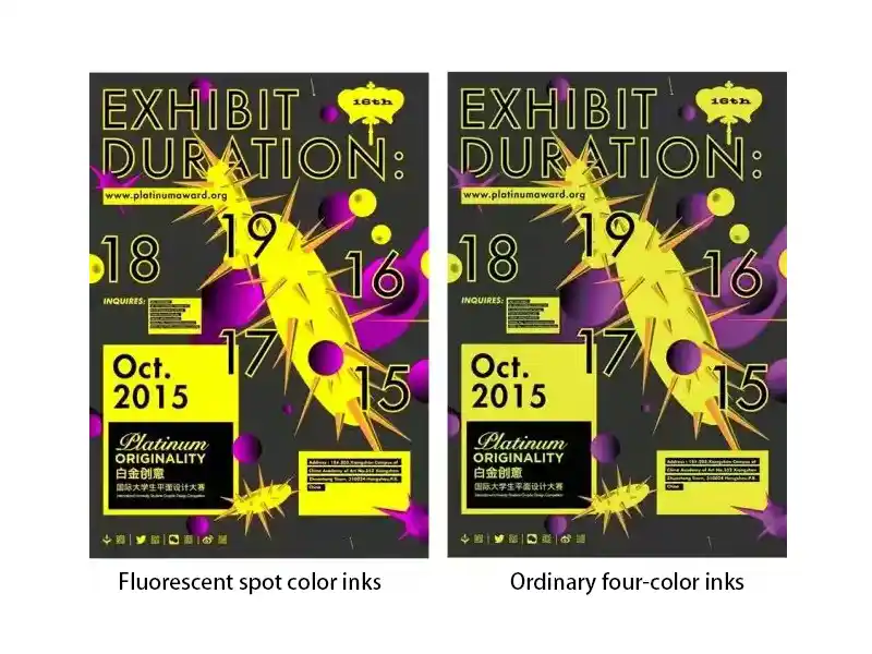
- Contain fluorescent pigments
- Look extremely bright and eye-catching under normal light
- Some also react strongly under UV light
- Common for safety labels, youth brands, limited editions, or streetwear packaging
Fluorescent spot colors are much more vibrant than any CMYK equivalent. However, they also come with some downsides:
- Higher ink cost
- Shorter shelf life in some cases
- More sensitive to printing conditions
- Harder to keep exactly the same between different print runs
Pros and Cons of Pantone Spot Color Printing
Advantages of spot / Pantone colors:
- Very good color consistency across jobs and substrates
- Strong coverage and higher opacity, especially on kraft or colored boards
- Access to metallic, fluorescent, and other special colors
- Excellent for strict brand color control
Limitations of spot colors:
- Higher cost when multiple spot colors are used
- Not ideal for photos or complex images (you still need CMYK for that)
- Limited by the number of units on the printing press
- More setup time, so usually better suited to medium and large runs
CMYK vs Pantone: How to Choose for Your Packaging Project
When CMYK Alone Is the Best Choice
Choosing CMYK only is usually best when:
- Your design includes full-color photographs or detailed graphics
- You have many different colors in one layout
- Budget is tight
- You need small or medium runs, or frequent design changes
Common examples:
- E-commerce mailer boxes with photo-based graphics
- Promotional packaging with seasonal or campaign artwork
- Printed inserts and cards with images and text
When Pantone Spot Colors Are Worth It
Pantone spot colors are worth the extra cost when:
- Your brand color must be very consistent – especially logo colors
- You have a simple design (for example, logo and a few solid shapes)
- You want a specific color that CMYK cannot match, such as:
- A particular vivid orange or red
- Metallic gold or silver
- Fluorescent pink, green, etc.
In many long-term brand packaging projects, the logo and key brand elements use a Pantone color, while the rest of the content may be CMYK.
Combining CMYK + Spot Colors (Hybrid Approach)
A very common solution for paper packaging is a hybrid setup:
- CMYK for photos, gradients, and general background
- 1–2 Pantone spot colors for the logo and key brand areas
This gives you:
- Rich, flexible artwork
- Stable brand color where it matters most
- A balance between cost and quality
For example:
- A cosmetic box printed CMYK + Pantone 872 C (metallic gold) for logo accents
- A mailer box printed CMYK + a special Pantone red for the brand name
Keep in mind that each extra spot color adds a plate and setup cost, so it is wise to focus on one or two key spot colors instead of many.
Cost, Quantity and Technical Factors to Consider
When choosing between CMYK and Pantone, discuss these points with your packaging printer:
- Printing method
- Digital printing usually uses CMYK (plus sometimes extra process colors), and spot colors may be simulated, not truly mixed.
- Offset and flexo printing can handle real spot colors more easily.
- Order volume
- Small runs: digital CMYK is usually cheaper and faster.
- Large runs: offset or flexo with spot colors can be more cost-effective per unit.
- Material
- White coated paper shows bright, clean colors.
- Uncoated or kraft paper will make colors appear softer and darker.
- Metallic and fluorescent inks will also look different on coated vs uncoated surfaces.
- End use
- Retail shelf packaging needs strong visual impact and stable brand colors.
- Shipping boxes may allow slightly more tolerance if they are mainly functional.
The more information you give your printer (brand guidelines, Pantone codes, target look, usage), the easier it is for them to recommend the right color setup.
Preparing Artwork for Accurate Packaging Colors
Set Up Files in the Correct Color Mode
For print-ready artwork:
- Set your design file to CMYK color mode, not RGB.
- If your design includes Pantone spot colors, assign Pantone swatches directly in your software (Adobe Illustrator, InDesign, etc.).
Avoid building everything in RGB and converting at the last minute. That is how you lose control over how colors change.
Dealing With Black: Text, Backgrounds and Small Details
A few simple rules help avoid common black-printing problems:
- Body text and small details
- Use 100% K only (C0 M0 Y0 K100).
- This gives crisp edges and avoids fuzzy, misregistered letters.
- Large black areas (panels, backgrounds)
- Use a rich black formula recommended by your printer.
- Make sure they confirm the values for your specific paper and press.
Never use rich black for small type unless your printer specifically approves it.
Checking Pantone and CMYK Conversions
Sometimes you want to print a Pantone brand color, but the job will be produced in CMYK only (for example, digital printing). In that case:
- Check the CMYK equivalent suggested in your design software.
- Remember that it is an approximation, not a perfect match.
- Very bright Pantone colors, especially neon and metallic ones, cannot be reproduced in CMYK.
It is a good idea to ask the printer for:
- A printed sample of that CMYK build on similar material, or
- A standard color chart showing how that CMYK combination actually looks on paper.
Understanding the Triangle and Cube Icons in Color Pickers
In software like Adobe Illustrator or Photoshop, you sometimes see:
- A small triangle with an exclamation mark next to a color
- A small cube icon
These mean:
- The triangle warns that the current color is out of the CMYK printable gamut. The software suggests a nearby CMYK-safe color below it.
- The cube shows the closest web-safe color, used for older web standards.
If you are designing for print:
- Pay attention to the triangle.
- If you ignore it, you may be choosing a color that cannot be printed accurately in CMYK, which leads to surprises when the job is produced.
Proofing: From Screen to Printed Sample
To reduce risk, think about proofing stages:
- Digital (soft) proof
- Usually a PDF sent by the printer.
- Good for checking layout, spelling, and general color balance.
- Not perfect for exact color, because every screen is different.
- Hard proof / press proof
- A physical print on the same or similar material.
- Essential for color-critical jobs, especially with Pantone brand colors, metallic, or fluorescent inks.
Lighting also matters. View proofs under the type of light your product will most often be seen in (store light, daylight, etc.).
Common Questions About CMYK and Pantone for Packaging
1. Can CMYK match my exact Pantone brand color?
Sometimes it can get close, but not always. Some Pantone colors fall outside the CMYK range. Your printer can show you how close the CMYK simulation will look, usually with a printed sample.
2. Why does my printed box look darker or duller than what I see on screen?
Screens use RGB light. Print uses CMYK ink. Many screen colors, especially neons and strong blues, are simply not printable. Paper, coating, and lighting also change how you see color, so the final box will almost never look exactly like the backlit screen.
3. How many Pantone colors can I use on one package?
Technically, you can use several, but each one adds cost. Most practical designs stick to one or two spot colors plus CMYK, unless it is a very high-end or special project where budget allows more special colors.
4. Is Pantone always more expensive than CMYK?
Adding spot colors usually increases the cost of a job, because each spot color needs its own plate and setup. However, for long runs with simple artwork, a small number of spot colors can still be cost-effective and give better brand consistency than trying to force everything into CMYK.
5. Are metallic and fluorescent colors available in digital printing?
Some digital systems offer special toners or inks, but many metallic and fluorescent effects still require traditional spot inks or foil processes. It depends on the machine. Ask your printer what is possible on their specific equipment.
6. What information should I give my packaging printer to avoid color issues?
At minimum, share:
- Your desired Pantone codes (if any)
- Whether colors are critical or just approximate
- The material (white card, kraft, coated, etc.)
- Any references or samples you like
- Where and how the packaging will be used
The more details the printer has, the better they can advise you on CMYK builds, spot colors, and proofing options.
7. How do printers keep color consistent from batch to batch?
Good color control usually uses both machines and human eyes:
- First, the printer sets a target standard: this can be a Pantone color, L*a*b* values, or an approved “master sample” from a previous job.
- During printing, they may use a spectrophotometer or spectrodensitometer (a handheld color meter) to measure color patches or color bars and compare them to the target. Differences are expressed as ΔE (Delta E). If ΔE is within the agreed tolerance (for example, ≤2–3), color is considered acceptable.
- On some presses, there are even inline spectrophotometers that automatically scan the sheet or web and adjust ink keys in real time to keep color consistent.
- Finally, a person still does a visual check under controlled light, comparing the production sheet to the Pantone guide or approved sample. Instruments say whether the numbers are correct; the human eye decides whether the color “feels right” for the brand.
For many small and medium packaging runs, printers may rely more on visual comparison plus a Pantone fan or a past sample. For strict brand work or large brand owners, it is common to combine instrument measurement (ΔE) with visual approval and to follow standards such as ISO 12647 for process control.