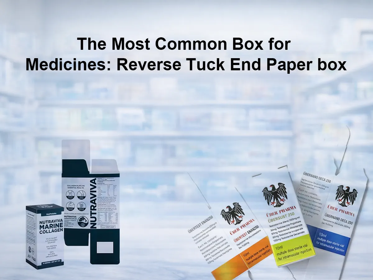
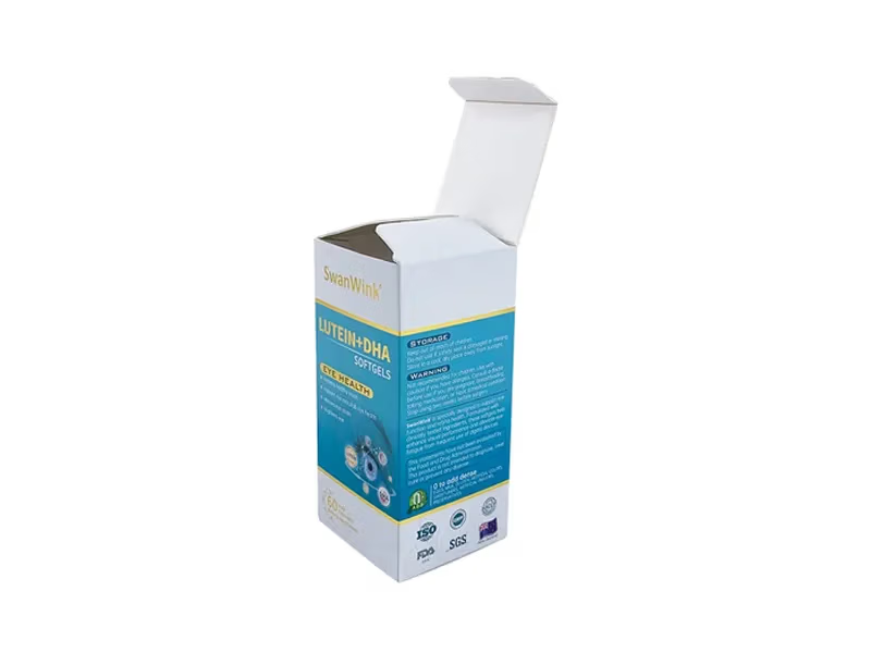
When people talk about paper boxes for medicines, the most common style is often the reverse tuck end paper box . Some buyers use informal names for it, but in English-language packaging this is the standard term. It is widely used because it is simple, low-cost, easy to pack, easy to ship flat, and gives enough panel space for product information, branding, and regulatory text. In pharmaceutical paper box references, a reverse tuck end paper box is defined by top and bottom closure panels that fold in opposite directions, and it can be assembled by hand or by automation.
This box style is especially common for lightweight medicine formats such as tablets, capsules, sachets, and blister-packed products. That does not mean it is the right choice for every drug pack. Heavier products, glass containers, or packs running on very fast automated lines may need a different structure. But for many routine medicine paper box , reverse tuck end remains the practical starting point.
What Is a Reverse Tuck End Paper box?
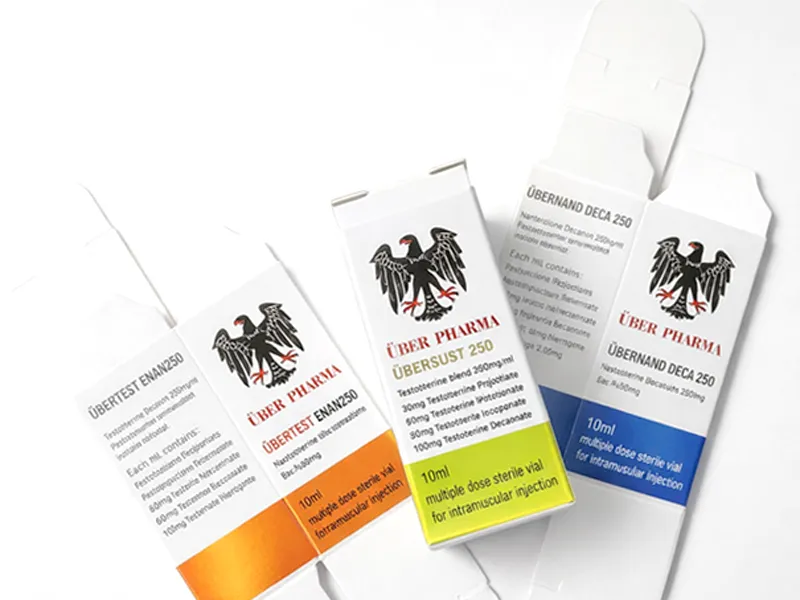
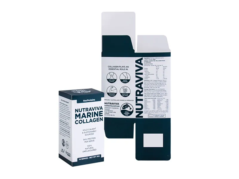
A reverse tuck end paper box is a folding paper box with a tuck flap at both ends. The top flap tucks to one side of the box, and the bottom flap tucks to the opposite side. That is the key difference. It sounds small, but it affects how the box opens, closes, and runs on the packing line. Because the structure is simple, it is easy to produce and easy to use in large quantities.
For medicine packaging, that simplicity matters. Many pharmaceutical products need a paper box that protects the primary pack, carries clear printed information, and works efficiently in storage and packing. A reverse tuck end paper box does that job well without adding much structural cost. This is one reason it is so common in OTC and prescription-related outer paper box for light products.
Why This Box Is So Common in Medicine Packaging
The first reason is cost control. Reverse tuck end paper box use a familiar folding-paper box structure that is efficient to die-cut, glue, store, and ship. They ship flat, so they do not take up much warehouse space before filling. That helps both manufacturers and contract packers.
The second reason is packing convenience. This style can be assembled manually or by automation, which gives flexibility across different production volumes. A small run and a large run can both use the same basic box style.
The third reason is printable surface area. A medicine paper box is not only a container. It is also an information carrier. It needs room for the product name, strength, dosage form, barcode, batch information, expiry date, storage notes, and warning text where required. A folding paper boxgives enough flat, readable space for that information in a way that a blister or bottle alone often cannot. FDA labeling guidance for OTC medicines shows how detailed medicine labeling can be, and the U.S. Drug Facts format has strict presentation rules, including a boxed format and color contrast requirements.
Common Paper Materials for Medicine Boxes
The most common board for this kind of paper box is SBS paperboard. SBS stands for solid bleached sulfate. In practical terms, it is a bright white paperboard with a smooth surface and strong print performance. That matters in medicine packaging because text must be clear, small details must reproduce well, and colors must stay clean. SBS is also a good substrate for embossing and other finishing effects when a product needs a more premium look.
A second option is kraft-based board or other natural-looking unbleached paperboard. This material gives a brown, natural appearance. It is sometimes chosen for herbal products, wellness products, or brands that want a more earthy image. The trade-off is that kraft does not give the same bright white print base as SBS, so color reproduction can look less crisp.
A third option is gold or silver cardstock for higher-end presentation. This is not the normal choice for routine pharmacy paper box, but it is used for premium healthcare, nutraceutical, or gift-oriented health products. Metallic paperboard can create stronger shelf impact, especially when paired with selective coatings, foil, or embossing. Public packaging references from SLD Packing and other folding-paper boxsuppliers show that metallic substrates and decorative finishes are standard options in custom paper box production, though they usually add cost and are best reserved for products that need a premium position.
Table 1: Common Paper Materials for Medicine Boxes
| Material | Surface look | Print performance | Cost level | Typical use |
|---|---|---|---|---|
| SBS paperboard | Bright white, smooth | Excellent for fine text and full-color printing | Medium | Standard medicine paper box |
| Kraft / natural board | Brown, natural, less bright | Good, but color appears less vivid than on white board | Low to medium | Herbal, natural, eco-style products |
| Gold or silver cardstock | Metallic, premium | Strong visual impact, often paired with special finishes | High | Premium health or promotional packs |
In short, SBS is the standard choice because it balances print quality, consistency, and cost. Kraft works when the brand image matters more than perfect color brightness. Metallic board works when presentation matters more than economy.
Common Printing Methods for Medicine Paper Box
For most medicine boxes, CMYK printing is the normal choice. It is practical, scalable, and suitable for multi-color graphics, photos, instructions, and general packaging artwork. If the design includes ordinary product graphics and no unusually strict brand color requirement, CMYK is usually enough. In the custom packaging market, CMYK offset remains a standard production method.
When exact color matching matters, especially for a logo or master brand color, Pantone printing is often added. Pantone describes its system as a universal language of color used by brands and manufacturers to make color-critical decisions through the workflow. In practical packaging terms, this is why companies choose Pantone for logos or identity colors that must look consistent across batches and suppliers.
Some projects also use special printing or finishing. Common examples include embossing, debossing, foil stamping, spot UV, matte coating, and gloss coating. These are not necessary for every medicine paper box. In fact, many routine pharmaceutical packs stay simple for cost and readability reasons. But premium OTC products, wellness items, and display-oriented health products may use these finishes to create a stronger visual result. SLD Packing’s public service pages list CMYK, Pantone, foil stamping, embossing/debossing, spot UV, and matte or gloss coatings among standard paper box finishing options, which reflects common custom-paper box practice rather than a rare specialty service.
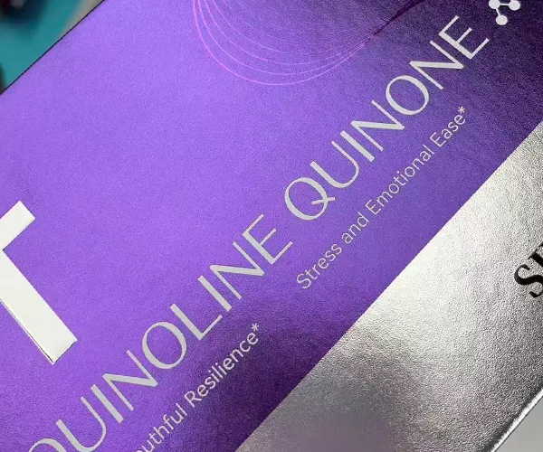
Table 2: Comparison of Printing Methods for Medicine Boxes
| Printing method | Best for | Visual effect | Cost level | Common application |
|---|---|---|---|---|
| CMYK | Multi-color graphics, general packaging artwork | Flexible and practical | Low to medium | Routine medicine paper box |
| Pantone | Logos and strict brand color matching | More precise single-color consistency | Medium | Brand marks, key identity colors |
| Special finishing | Premium appearance and shelf impact | Metallic, raised, glossy, or textured effects | Medium to high | Premium OTC or wellness packaging |
The best approach is usually simple: use CMYK for the main design, add Pantone only where color accuracy matters, and use special finishing only when it supports the product position and budget.
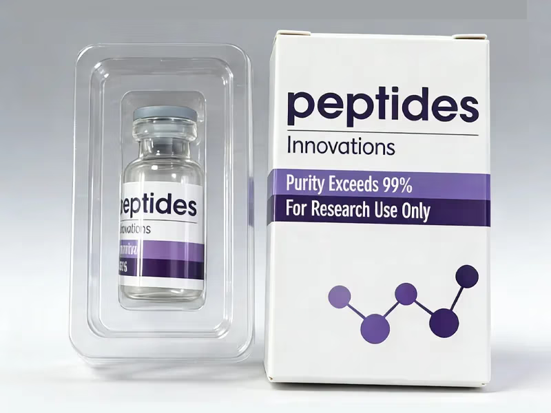
What Usually Goes Inside the Paper Box?
In many medicine projects, the paper box is the outer retail box, while the product-contact pack is something else. That inner pack may be a blister, a bottle, a sachet, or another sealed format. Guidance from Australia’s TGA explains this clearly: a cardboard box containing a blister pack of tablets or capsules is an example where the paper box is an outer pack and the blister is the direct product-contact package.
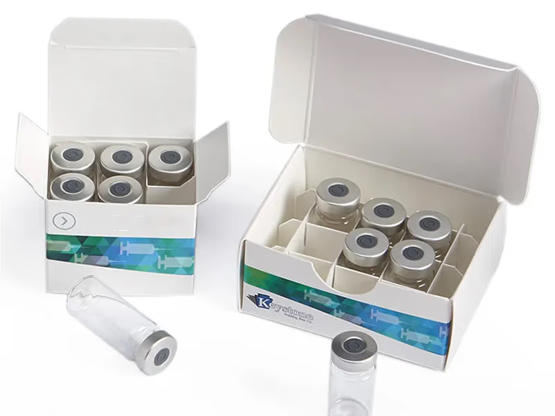
For tablets and capsules, blister packs are very common. Körber Pharma describes blister packaging as a widely used pharmaceutical format in which a plastic cavity, often PVC or PET, is sealed with foil. It is mainly used for oral solid doses such as tablets and capsules, and it helps with product protection, tamper resistance, dose control, and patient compliance. This is why many medicine paper box are designed around the size and shape of the blister card inside.
Other common inner packs include small bottles, sachets, or folded leaflets. In many projects, the leaflet is almost as important as the box because it carries detailed directions and safety information that would not fit well on the paper box panels alone. The paper box therefore works as a bridge between product protection and readable communication.
What Information Needs Space on a Medicine Box?
A good medicine paper box needs more than a nice appearance. It needs clear information planning. Typical content includes the product name, dosage strength, dosage form, net quantity, batch or lot number, manufacturing or expiry date, barcode, storage conditions, and warning or usage text required in the target market. The exact panel layout depends on whether the product is prescription, OTC, export, or sold through a special channel.
For OTC products in the United States, the FDA requires standardized Drug Facts information, and the regulation includes detailed presentation requirements. Even when a full label extends across more than one panel, the package structure must support readability. That is why medicine-paper box design is not just about shape and artwork. It is also about making sure the box leaves enough room for legally required information.
This is one reason reverse tuck end paper box work so well. They give enough flat surface for structured information without needing a complex box design. For many standard medicine products, that balance between structure and print space is exactly what buyers need.
When a Reverse Tuck End Paper Box Is Not the Best Choice
Even though reverse tuck end paper box are common, they are not always the best answer. If the product is heavy, the bottom closure may need more support, and an auto-bottom structure can be a better option. If the line speed is very high and the filling process is highly automated, a seal-end style may be preferred. If the product is premium and presentation matters more than efficiency, a rigid box may be used instead.
In other words, reverse tuck end is best seen as the default practical paper box for many light medicine products, not as a universal rule. The right structure still depends on product weight, filling method, retail position, and labeling needs.
Conclusion
For many medicine products, especially tablets, capsules, sachets, and blister-packed items, the reverse tuck end paper box remains the most common paper box because it is economical, easy to assemble, easy to ship flat, and easy to print. It works well with standard pharmaceutical materials such as SBS paperboard, and it supports common print methods like CMYK, with Pantone added when brand color control is important. It also leaves enough panel space for the practical reality of medicine packaging: product details, warnings, traceability, and instructions.
The simple rule is this: choose SBS and CMYK for the standard job, add Pantone for color control, use kraft for a natural look, and choose metallic board or special finishing only when the product needs a more premium shelf image. That approach keeps the paper box practical, readable, and cost-aware, which is exactly why this box style continues to be so common in medicine packaging.