
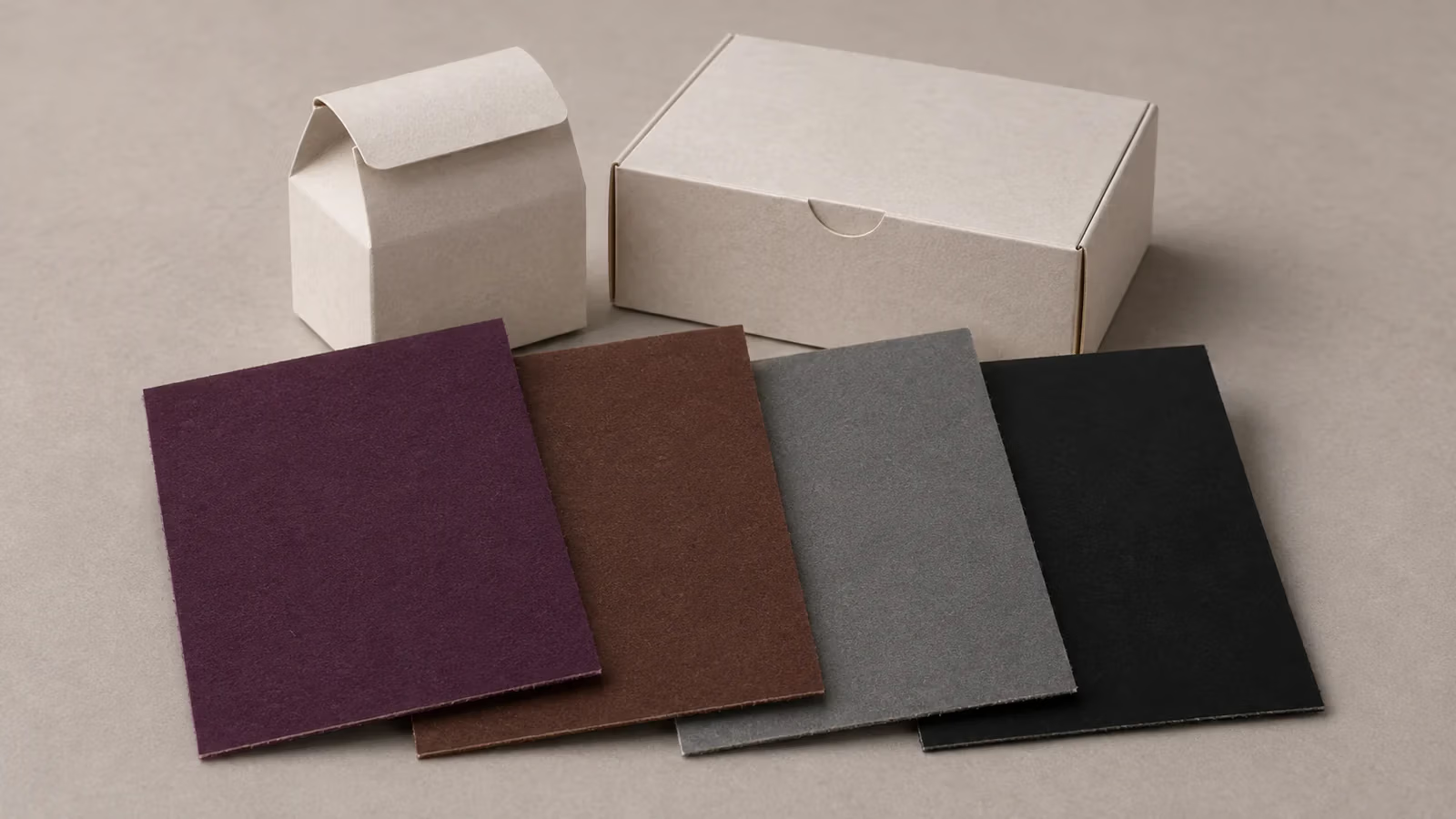
The purple on your box proof looks blue. The cocoa brown looks red beside the product label. The gray looks neutral on screen but pink on paper. Small black text and a broad black panel can look equally dark on screen even though they need different print settings.
Start with the symptom. Check hue for purple and brown, neutrality for gray, and edge sharpness or depth for black. Then decide what the printer should match and what you will approve. For a brand-critical color, agree on the production stock, finish, physical reference, and acceptance criteria before the full run. For fine black details, check the exported print PDF and the finished sample.
A quick check for each color
| What you see | What to check first | What to approve |
|---|---|---|
| Purple looks too blue, red, or dull | Target hue and what the chosen print process can reproduce | A violet patch on the chosen stock and a finished panel |
| Brown looks too red, yellow, or greenish | Undertone, paper shade, and the parts it must match | Side-by-side samples of the box and any matching label or insert |
| Gray picks up a color cast | Which inks make up the gray, plus the stock and finish | A gray patch at the intended tint and at panel size |
| Black text has colored edges or a black panel looks weak | Ink separations for fine details and ink coverage for the panel | Legible detail, verified codes, and a finished black panel |
Why the same CMYK values can print differently
CMYK percentages tell the printer how much of each process ink to apply in a given area. The inks are cyan, magenta, yellow, and black. For lighter tones, tiny dots of ink leave some paper visible. Changes in how those dots print, the shade and surface of the paper, or the balance between inks can change the result. An ICC profile describes a particular printing condition and helps prepress predict what its ink combinations will look like. Ask your printer which profile and PDF settings they want before converting the artwork. International Color Consortium guide to print characterization.
A spot color uses a dedicated ink mixed for a specific shade. It can help when a prominent logo or flat panel is hard to reproduce consistently in process inks, or when the desired color is outside the range of the selected CMYK process. Check whether the printer will run a separate spot ink or simulate it with the inks available on the press. Those are different production choices. SLD guide to CMYK and Pantone spot colors.
Agree on the hue for purple before chasing saturation
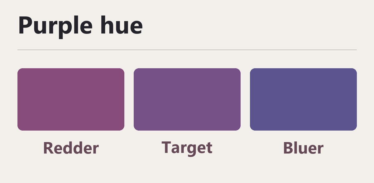
A process purple often depends heavily on the balance between cyan and magenta. If the proof leans toward blue-violet or red-violet, first decide which direction matters for the brand. If a vivid violet simply looks dull, the target may be outside the press and stock’s gamut, the range of colors that combination can reproduce. Increasing a percentage in the file can move the hue without giving you the saturation you wanted.
Bring the printer a physical target and ask for a few candidate patches on the proposed stock. For example, a perfume box might need a deep aubergine that still reads as purple in a dim display. Have the designer and buyer pick the acceptable hue from side-by-side patches, then look at it across a full-size panel with the intended finish. If the process versions are too muted, compare a dedicated spot-ink sample and confirm the production cost before choosing.
Check brown beside the pieces it must match
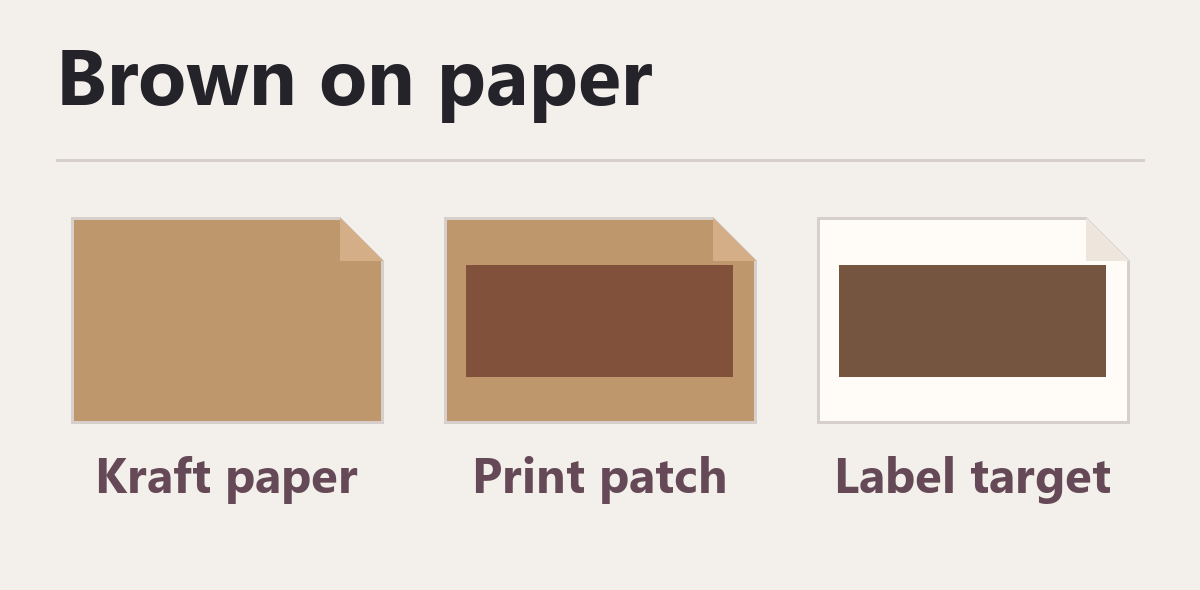
Two browns can be equally dark and still look unrelated. A reddish chocolate brown, a golden coffee brown, and a muted brown can all fit the same broad brief. They give very different results when the carton sits beside a pouch, paper insert, or printed label.
A process brown can use a mix of cyan, magenta, yellow, and black, depending on the shade and the print condition. Reusing a CMYK recipe from another stock can change the undertone as well as the darkness. Unprinted kraft paper also has a color and texture of its own. If the artwork moves from white board to kraft, compare a blank piece of the kraft with a printed brown patch. Decide whether the brown should come from the board itself or from ink printed over it.
If the carton and label come from different suppliers, send both the same physical reference and put both proofs on the table together. Review the finished pieces under the same light. Decide which component is the color reference and how close the two need to look when they are next to each other. When materials differ, discuss whether you need an individual target for each material to get an acceptable visual match.
Check the ink separations when gray turns pink or blue
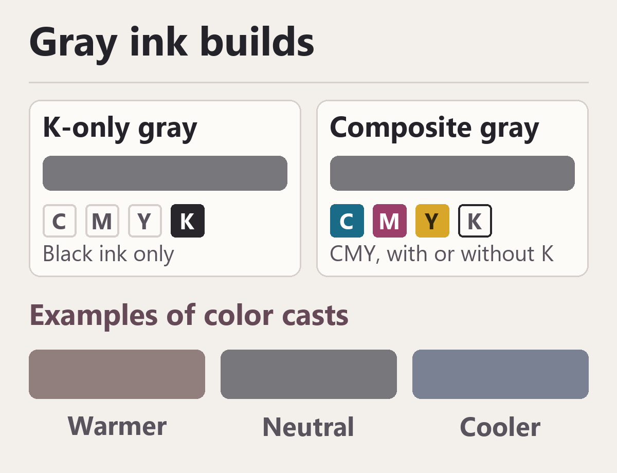
K-only gray uses a tint of black ink. Composite gray uses a balance of cyan, magenta, and yellow, sometimes with black. Both can look neutral on a monitor. In print, a change in the relative strength of the color inks can make a composite gray look tinted. A K-only tint removes those three ink variables, while the paper, the black ink, and the printing condition can still affect its appearance.
For simple rules, icons, or background tints that only need to read as gray, try K-only first. For a broad brand panel, decide whether you want a neutral gray or a deliberate warm or cool gray. Ask to compare the K-only result with a controlled composite gray or a spot gray on the actual stock. An intentionally warm gray can be an approved target. The proof gives everyone a way to distinguish that choice from an unintended cast. Idealliance explanation of gray balance across substrates.
Ask prepress to check the final PDF separations. A gray created in RGB and converted on export may contain several process inks. For a gray intended to be K-only, verify that the relevant object appears only on the black separation. A separation shows what each ink will print.
Specify black separately for fine details and large panels
Keep small text and codes sharp
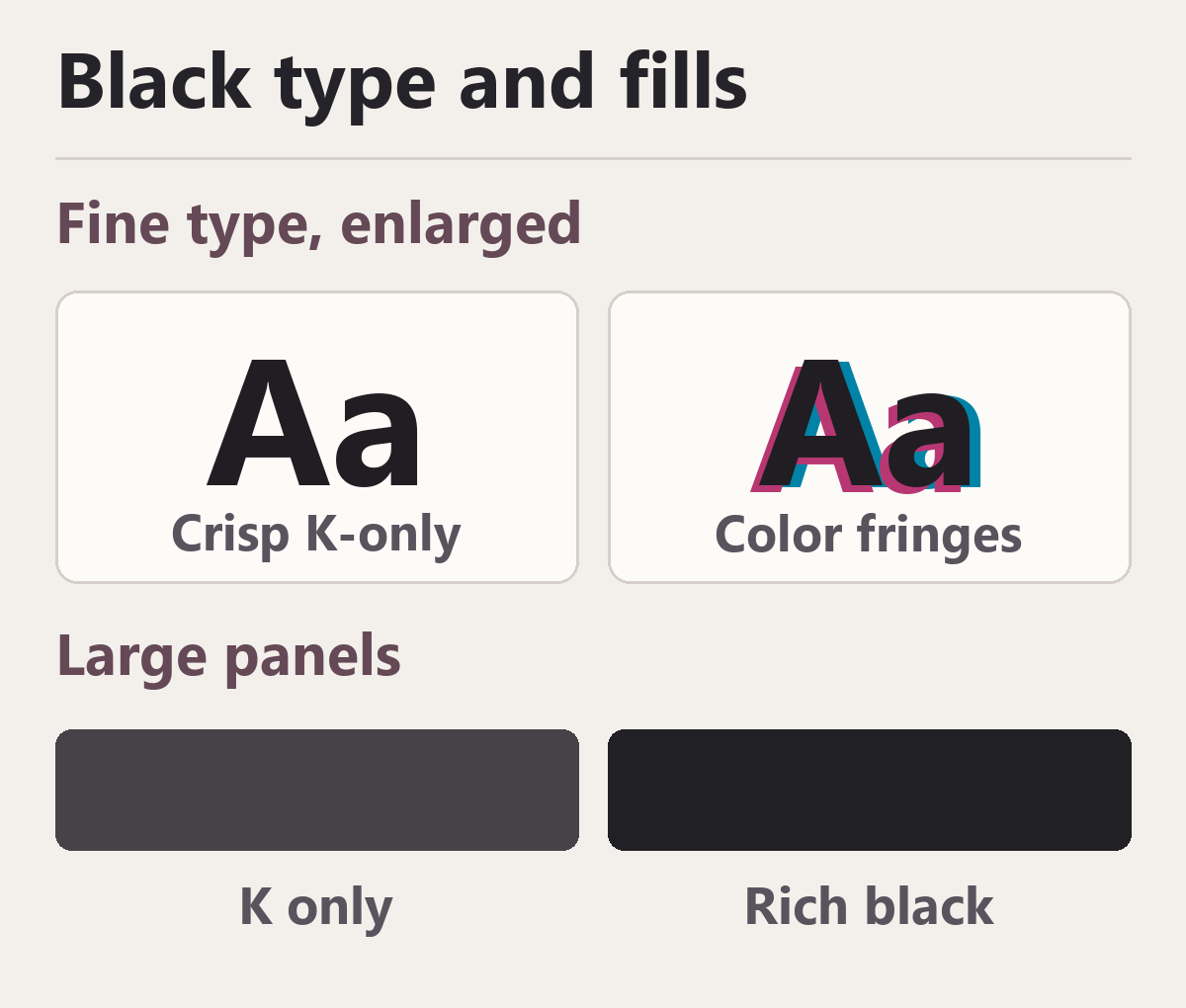
For small positive black text and fine black lines in conventional CMYK artwork, C0 M0 Y0 K100 is a common starting point. With one ink forming each letter, you avoid colored fringes caused by misalignment between several inks. Have prepress confirm the build in the exported PDF and check how the text interacts with the background. Small white text reversed out of a dark panel needs its own check because it relies on an opening in the ink.
For a retail barcode or QR code, coordinate the artwork with the printer and the applicable code specification. For a conventional linear barcode, use a single dark ink for the bars on a light background. Black on white gives strong contrast, including when one black ink is used in a CMYK job. For a QR code, keep the dark modules and light spaces clearly separated. Leave the required clear margin around the code, known as the quiet zone, and keep it away from folds or finishes that interfere with reading. For retail use, ask how the code will be verified on the finished pack. A successful scan with a phone is an informal check. GS1 guide to linear barcodes and GS1 guidance on retail 2D barcodes.
Proof a deep black at the size and finish you will sell
A broad K-only panel may look lighter than you want on some papers. Rich black adds one or more process inks to black to achieve a deeper tone. Ask your printer for a build suited to the press and stock, then compare a large patch with the K-only version. A small chip can hide changes in appearance that are obvious on the front of a box. Check any fine white details, plus how the panel looks after lamination or varnish.
The printer also needs to check total area coverage, the sum of the four ink percentages in any one area. Too much ink for the press and stock can cause drying problems or transfer onto the next sheet in a stack. Ask prepress to check the darkest areas against the printer’s limit, including where elements overlap. In Acrobat Pro, Output Preview can show separations, rich-black warnings, and areas above a selected coverage limit. Adobe Acrobat Output Preview guide.
Paper and finish are part of the color specification
Put an unprinted sheet next to the proof. A brighter white, a warm cream, and a brown kraft each change what surrounds and shows through the ink, especially in lighter tints. Coated and uncoated stocks also behave differently. Pantone’s C and U suffixes identify the coated and uncoated reference appearances in its graphics guides. Your production board and finish still need to be checked in person. Choose the stock that gives you the intended result on the finished piece, including any deliberate contrast between a cool ink and a warm paper. Pantone explanation of coated and uncoated references.
Specify the paper grade, shade, coating, and finish in the job brief. If a substitute stock, laminate, or printing process is proposed after approval, compare a new sample with the original reference before authorizing the change. Look at both pieces side by side under agreed lighting. When shelf lighting matters, make a second check in the intended display conditions.
How much proofing does your project need?
Routine artwork with flexible color
Ask for the printer’s PDF settings and review layout, type, color separations, and code placement. A PDF proof is useful for checking content. A calibrated soft proof using the appropriate output profile can help predict color, and a physical sample is worth requesting if a broad flat panel is central to the design or the stock is unfamiliar.
Brand packaging or a costly repeat order
Choose the surfaces that must match across products and orders. Ask what a physical proof represents. A color-managed contract proof can simulate an agreed printing condition. A press sample on the specified production stock lets you inspect the ink and stock together. If lamination, varnish, or another finish changes the appearance, agree on a finished sample as well. Record the file revision, stock and finish, proof date, and who approved it. Keep a reference for reorders.
A signature color with a tight match requirement
Ask the printer to compare process and spot options against the target. For a spot ink, an ink drawdown is a small test application of ink on the proposed stock. It helps compare the ink and material before committing to a press run. Then review the appearance on a finished sample where needed. If you use instrumental color checks, agree on the target, the measurement conditions, the formula such as Delta E 2000, and an achievable tolerance for the job. Delta E is a way to express the difference between two measured colors. A dedicated ink can simplify the color build, while paper, finish, and press conditions still affect the match. Flexographic Technical Association guide to drawdowns and Graphic Packaging International prepress guidelines.
What to send with your artwork
- Mark the critical areas. Point out the brand purple, the brown that must match another component, the gray that should read neutral, and which black areas are fine detail or broad coverage.
- Provide the reference. Send a physical sample or the full spot color identifier where applicable. Tell the printer which sample takes priority if references differ.
- Confirm the production plan. Write down the board, surface finish, print process, process or spot color decision, and who will check the final separations.
- Define the approval. Identify the proof or finished sample to sign off, the viewing conditions, any agreed measurement tolerance, and who will verify retail codes on the finished pack.
- Record changes. If the artwork, stock, finish, or print process changes, confirm whether the affected areas need a fresh proof before production.
Send your artwork, color references, and intended finish to SLD Packing to discuss what to proof before you approve the full run.