
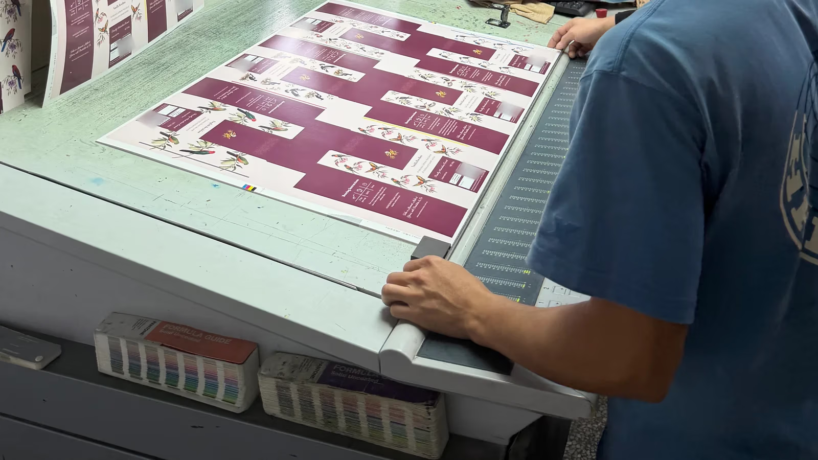
The parrot on a tea carton looks smooth at normal viewing distance. Move a print loupe over the feathers, and the colors break into tiny dots. Those dots help build the image. A colored shadow beside a letter or a doubled outline is a different thing to investigate.
At a packaging press check, start with the whole printed sheet under the agreed lighting. Compare it with the approved reference, look across repeated carton layouts, and enlarge any area that looks off. Approve a specific sheet and record what it covers. Then check details such as the fold, the cut edge, and the final surface finish on a finished carton.
What is a packaging press check?
A press sheet is a printed sheet that may carry several copies of a flat carton layout. A press check is a review of an actual sheet from the press after setup and before the full production run proceeds. The sheet you approve provides a reference for the run. A PDF approval, a color proof, and a finished carton sample answer different questions, so agree beforehand which reference the press sheet should match and what the press check will cover. U.S. Government Publishing Office guide to press sheet inspections.
For a brand owner, that can be as simple as bringing the approved color reference, having the current artwork version on hand, and marking the parts of the carton that are most important to get right. On this tea carton layout, the large burgundy panel, the bird illustration, and the small reversed lettering give you three different things to look at on the same sheet.
1. Look at the whole sheet first
Put the press sheet and the approved physical reference side by side under the agreed viewing light. Start with the panels customers see first. The large burgundy area on the tea carton gives you room to spot an obvious change in shade or uneven coverage. Compare the same panel across the repeated carton layouts on the sheet. A single cut-out can look fine while a difference is easier to see across the full sheet.
Look at the bird at normal viewing distance before reaching for the loupe. Check whether the colored areas, feather details, and fine lines read as intended. Use the approved artwork to find the same areas, and use the agreed physical reference to make the color comparison. If a customer approves remotely, agree in advance which reference governs color and how the approval will be documented. A video can show where to look. A camera feed and the viewer’s screen can change how the color appears. SLD guide to CMYK and spot colors.
2. Use a loupe to look at edges and printed detail
A print loupe is a small magnifier that rests on the sheet. Start with the outline where the colored feathers meet the light background.
Watch the camera move from the loupe on the tea-carton sheet to the magnified bird. Look at the outline where the feathers meet the light background.
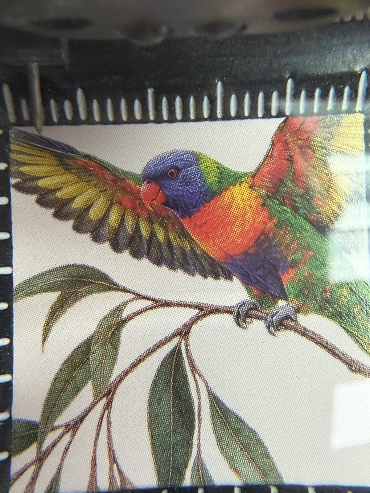
Halftone dots are small ink marks that create variations in tone and color when viewed together. Their presence in a magnified print is expected. Check registration, the alignment between printed colors, at the registration marks and at fine edges in the artwork. If you suspect a problem, compare the same area on the reference and on other copies of the carton layout. A colored sliver outside an edge, an unexplained doubled outline, or a fine detail that closes up is a reason to ask the operator for a closer check. A phone close-up can also introduce glare or colored fringes, so inspect the physical sheet before deciding what caused the change. U.S. Government Publishing Office guide to loupe, halftone and registration checks.
The same approach works on the thin strokes of lettering or icons. Look at them at actual size for legibility, then use the loupe to see whether the shape of the printed detail matches the artwork. For a retail barcode, record who will verify the actual printed symbol. A loupe can help spot an obvious defect. Retail barcode verification assesses whether the printed symbol meets the applicable quality requirements. GS1 guidance on measuring printed barcode quality.
3. Decide what you are approving
Once the critical areas are acceptable, mark and date the approved sheet and record the artwork version, the color reference, and any adjustments or exceptions. If something still needs attention, identify the exact carton position and detail, such as the small white text on a particular burgundy panel. Ask to see a fresh sheet after the change. Retain the approved sheet or agree who will keep it for production checks.
| At the press check | On the finished carton |
|---|---|
| Color against the agreed reference and visible consistency across the printed sheet | Appearance after the specified coating, lamination, or other finish |
| Fine text, illustration detail, and ink-to-ink alignment | Print position relative to the actual cuts and folds |
| The sheet, version, and checks accepted as the production reference | Fold and glue quality, carton fit, and code performance in its final position |
An approved press sheet gives production a reference to check against as the run continues. Agree how later sheets will be compared with it. Where finishing changes the appearance or function of the pack, keep a separate finished sample check on the schedule. U.S. Government Publishing Office guidance for holding a press sheet inspection.
If you are preparing a carton order, share your approved artwork, physical color reference, and the panels or details you want to check. That gives the printer a clear starting point for the press check and the finished carton review.