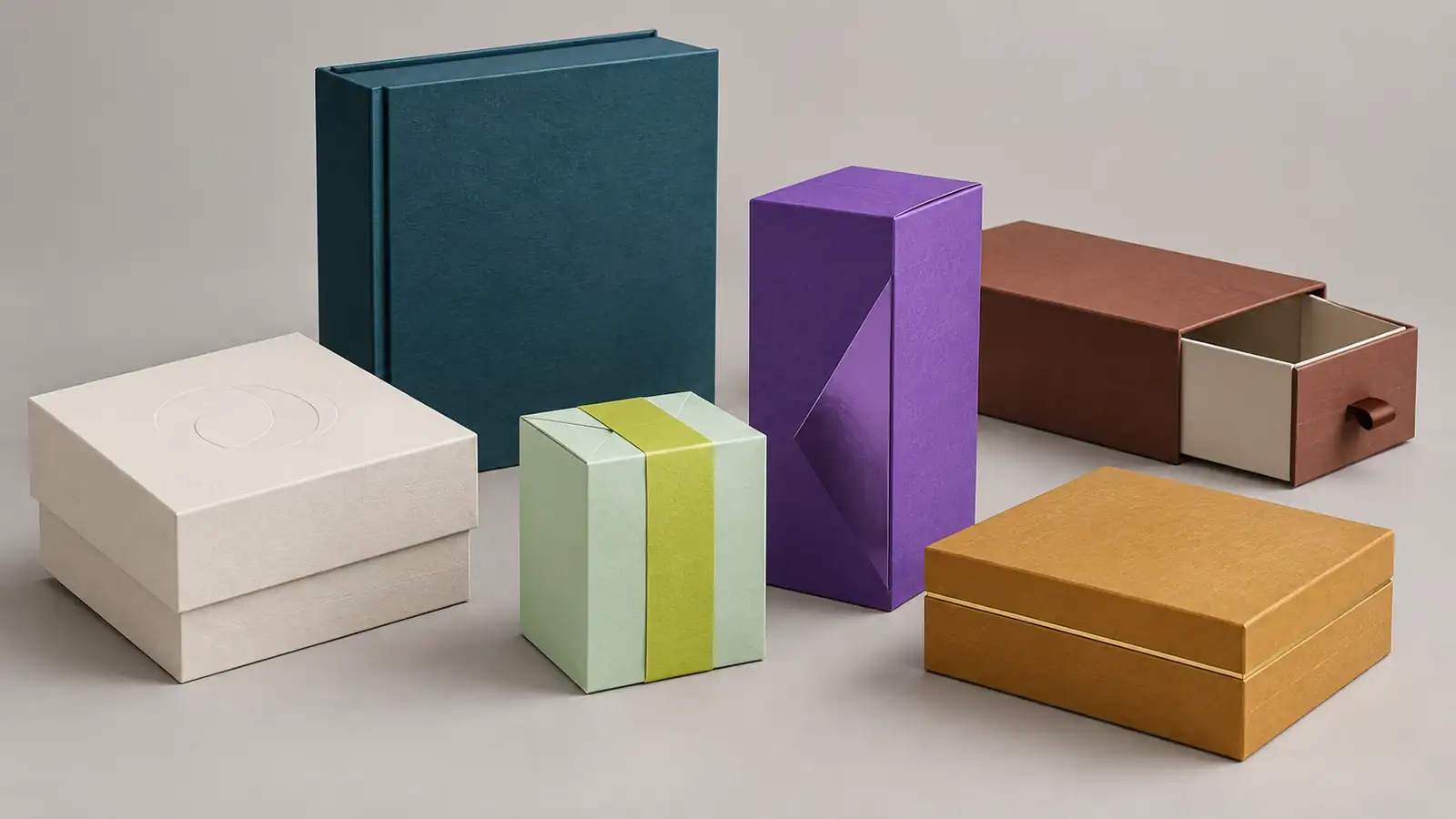
Taken together, the major 2026 forecasts suggest contrast rather than one winning shade: softened neutrals and grounded natural colors sit beside vivid digital accents. Pantone’s airy Cloud Dancer represents the quiet end of that spectrum, while WGSN and Coloro’s Transformative Teal, Cocoa Powder, Fresh Purple, and brighter green and pink directions add depth or energy.
The right choice is not simply the most fashionable color. It is the direction that fits your product, remains recognizable beside competitors, stays legible, and can be reproduced consistently on the actual paper and finish.
Why 2026 Has More Than One “Color of the Year”
Pantone named PANTONE 11-4201 Cloud Dancer its Color of the Year 2026, describing it as a versatile white that gives other colors room to stand out. Separately, WGSN and Coloro selected Transformative Teal as their 2026 Colour of the Year, alongside seasonal colors ranging from quiet near-neutrals to energetic brights.
These are independent forecasts, not competing print standards or a universal popularity ranking. For packaging teams, their value is directional: calm versus energy, nature versus digital culture, and long-lasting bases versus short-lived accents. BAKIC’s trend report from LUXE PACK New York 2026, focused mainly on beauty and premium packaging, observed a similar move toward pastels, milky hues, and gentle gradients while bright, playful details remained visible. It is a useful industry signal, not market-share data.
2026 Packaging Color Trends at a Glance
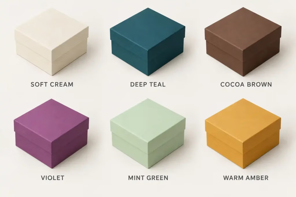
The named references below come from Pantone’s 2026 selection or WGSN and Coloro’s Spring/Summer 2026 and Autumn/Winter 2026/27 forecasts. They are grouped here as broader packaging directions rather than one calendar-year ranking.
| Color direction | Named forecast reference / related direction | Useful role in a palette | Strong starting points | Production watch-out |
|---|---|---|---|---|
| Airy white and soft cream | Cloud Dancer, Wax Paper | Base, negative space, interior | Skincare, wellness, luxury gifts, clean technology | Pale elements can disappear without enough contrast |
| Deep teal and cool blue | Transformative Teal, Blue Aura | Hero color or alternative dark | Beauty, electronics, wellness, premium boxes | The shade can shift toward blue or green by stock and lighting |
| Cocoa and earthy brown | Cocoa Powder | Warm dark, heritage base, natural accent | Chocolate, gourmet food, craft-led and gift packaging | Brown can become predictable in food categories |
| Digital purple and fuchsia | Fresh Purple, Electric Fuchsia | Statement color, seasonal panel, small accent | Beauty, fragrance, youth brands, limited editions | Highly saturated versions may sit outside standard CMYK reproduction |
| Mint and acid green | Jelly Mint, Green Glow | Soft base, SKU code, reveal color, high-energy accent | Wellness, beauty, sports, technology | A neon-like target may require a special ink rather than CMYK alone |
| Amber and warm gold | Amber Haze; warm-gold extension | Warm secondary color, focal detail, premium finish | Confectionery, gifting, seasonal launches, skincare | Amber can lose definition on warm or kraft-colored paper |
Six Color Directions and How to Use Them
1. Airy whites and softened creams create space
Pantone positions Cloud Dancer as an airy, softened white rather than a stark neutral. WGSN and Coloro’s Wax Paper moves further toward a creamy, yellowed near-neutral. Both suit skincare, fragrance, wellness, premium food, and minimalist electronics, especially when textured paper, embossing, a fine foil mark, or a matte surface carries part of the design.
A warm-white logo on a slightly different white board may almost vanish in print. Pair the pale base with a tested dark such as teal, cocoa, or charcoal for essential text, and approve the contrast on the chosen stock.
2. Transformative teal turns blue-green into a modern dark
Transformative Teal combines dark blue and aqua-green qualities. WGSN presents it as an alternative dark and specifically identifies packaging as one of its beauty applications. Blue Aura offers a softer cool-blue companion when full dark teal feels too heavy. Both can suit beauty, wellness, electronics, premium gifts, and nature-meets-technology positioning.
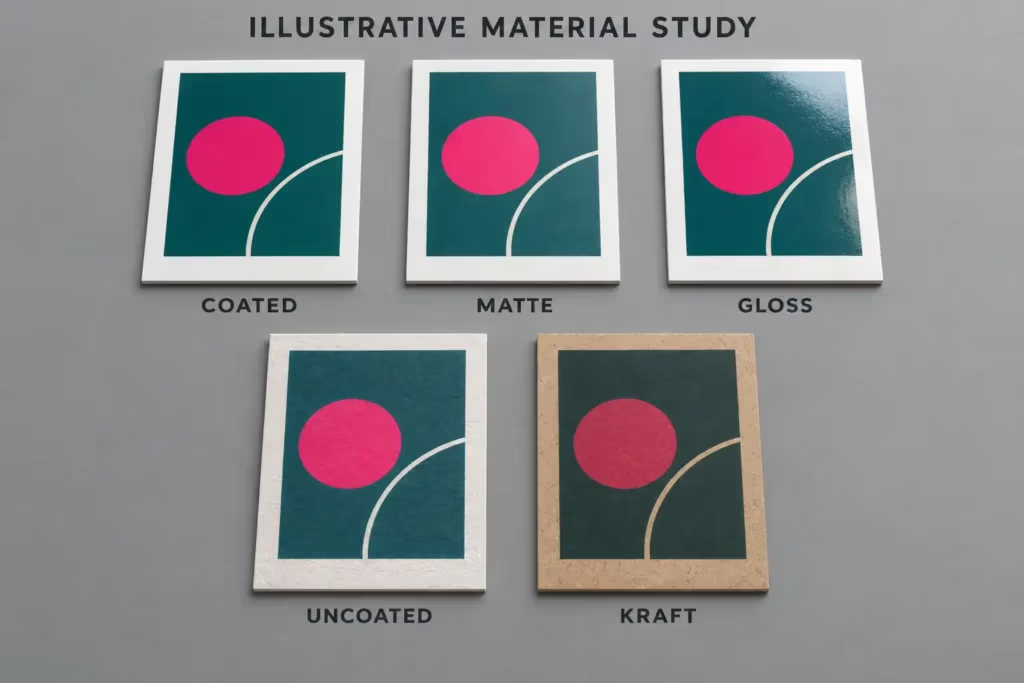
Pair teal with soft white for clarity, amber or copper for warmth, or a small fuchsia accent for digital energy. It can look darker and less saturated on uncoated or kraft-colored paper than on a white coated sheet. Teal may support a nature-related identity, but environmental claims still require evidence about the actual package.
3. Cocoa brown adds warmth, craft, and depth
WGSN and Coloro describe Cocoa Powder as a red-toned brown connected with nostalgia and craft. It fits chocolate and coffee, but can also replace black in premium gifts, ground a wellness palette, or warm up technology accessories. Cream creates a classic pairing; mint, pink, or a metallic detail makes it more contemporary.
In confectionery, use typography, structure, illustration, or a secondary color to avoid blending into a brown-heavy category. Large dark areas can also reveal coverage variation, fingerprints, rub marks, and edge wear, so compare protective options on a real sample. SLD Packing’s paper box lamination guide covers common finishes.
4. Purple and fuchsia bring controlled digital energy
Fresh Purple appears in the Autumn/Winter 2026/27 selection, while Electric Fuchsia appears in the Spring/Summer 2026 forecast. Both suit cosmetics, fragrance, creative products, and social-first launches. Purple can cover a full rigid box when the brand already owns that territory; fuchsia is often easier to control as an interior reveal, sleeve, label, or limited-edition panel.
Bright pinks and purples may look luminous on an RGB screen but flatter in standard CMYK. If intensity is essential, define a physical target early and ask whether a spot color, fluorescent ink, colored paper, or foil is more realistic. Give one energetic color the focal role.
5. Mint and green glow offer two levels of optimism
Jelly Mint is the softer, playful side of green; Green Glow is a sharper yellow-green. Mint can cover a background or interior, while acid green is usually stronger as a small accent, SKU marker, or surprise inside a mailer. Both can suit wellness, beauty, sports, technology, and younger product lines.
Pair mint with cocoa, teal, or warm white, and give Green Glow structure with a calm neutral or dark shade. Combine color coding with names, numbers, icons, or patterns so variants remain clear even when color is viewed or printed imperfectly.
6. Amber and warm gold make a package feel illuminated
Amber Haze appears in the Spring/Summer 2026 key colors. The broader family runs from honey and saffron through burnt orange to warm gold, suiting confectionery, gourmet food, holiday gifts, fragrance, and skin care. Pair it with teal for contrast, purple for a less conventional premium look, or soft white for a clean seasonal palette.
Metallic gold can extend the warmth, but metallic ink and foil stamping do not create the same reflection; review the guide to hot stamping before specifying the effect. Warm inks may also lose separation on kraft or yellow-toned stock, so test the actual combination.
Build a Palette, Not a One-Color Box
A trend color becomes more useful when it has a defined role. Keep a stable brand anchor, choose one supporting neutral, and reserve the most time-sensitive color for an accent, interior, sleeve, label, or seasonal variant. That makes it easier to refresh the package without rebuilding recognition.
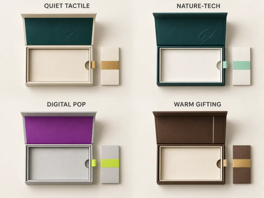
The proportions below are visual starting points, not ink formulas or fixed rules.
| Palette concept | Approximate visual hierarchy | Where it can work | Finish direction |
|---|---|---|---|
| Quiet tactile | 70% soft white/cream, 20% teal or cocoa, 10% accent | Skincare, fragrance, premium gifts | Textured paper, blind embossing, restrained foil |
| Nature-tech | 60% deep teal, 30% soft white, 10% mint | Wellness, electronics, modern beauty | Matte base with a controlled gloss detail |
| Digital pop | 60% neutral, 30% purple or fuchsia, 10% green glow | Youth beauty, accessories, limited editions | High-gloss or selective reflective accent after testing |
| Warm gifting | 60% cocoa or amber, 30% cream, 10% metallic detail | Chocolate, seasonal gifts, hospitality | Foil or embossing used as one focal feature |
Match the Direction to the Product and Packaging Format
Color has to work with category expectations, packaging structure or format, and the moment of use. These are starting points rather than category rules.
| Product or channel | Useful 2026 direction | Practical application |
|---|---|---|
| Cosmetics and skincare | Soft white, teal, mint, purple | Keep the outer pack calm and use a stronger color for the product name, inner tray, or reveal panel |
| Chocolate and gourmet gifts | Cocoa, amber, cream, teal accent | Use contrast to distinguish flavor or collection instead of depending on brown alone |
| Consumer electronics | Teal, cool blue, soft white, acid-green accent | Use a dark technical base with a clear information hierarchy and one high-energy cue |
| E-commerce mailers | Stable exterior with purple, fuchsia, mint, or amber inside | Put the expressive trend color in the opening sequence while keeping the shipping surface practical |
| Retail paper bags | Stable brand base with a trend-led side panel, handle, or gusset | Coordinate the bag with the primary box without copying every color in equal proportion |
| Luxury and seasonal gift boxes | Soft white, teal, cocoa, amber, metallic detail | Let the rigid structure and one tactile or reflective finish carry part of the premium signal |
Turn a Screen Palette Into Producible Packaging
- Give every color a job. Identify the permanent brand color, supporting neutral, seasonal accent, SKU code, background, and text color. A color without a role usually becomes visual noise.
- Select the stock and finish together. Coated white paper, uncoated stock, kraft, colored paper, gloss, matte, and soft-touch surfaces reflect light differently. Evaluate the target on the intended combination. See how finishes work beyond printing for the broader decision process.
- Choose the print system around the artwork. CMYK is practical for photographs, gradients, and multicolor graphics. A spot color may suit a solid brand color that needs tighter control or falls outside convincing CMYK reproduction. The CMYK and Pantone spot color guide explains the trade-offs. Do not treat an RGB or hex value—or the FHI reference PANTONE 11-4201—as a complete paper-packaging ink specification.
- Check hierarchy at actual size. Print the dieline full size and review the product name, variant, mandatory copy, fine lines, and barcode area. Use names, icons, or patterns as well as color for essential distinctions. Validate color associations, competitor shelf conventions, and label requirements in each target market.
- Approve a physical proof or prototype. Review the sample under more than one light source and at the expected viewing distance. Compare large solids, folds, wrapped edges, interior panels, inserts, bags, and other matching components; then record the approved reference and tolerance before production.
Common Color-Planning Mistakes
- Rebuilding a recognizable identity around one annual forecast. A trend is often safer as an accent, interior, or limited-edition layer.
- Using a “natural” palette as an environmental claim. Beige, brown, or green communicates a look, not verified sourcing, recyclability, or impact.
- Ignoring regional category codes. A flavor, quality, or benefit association in one market may not transfer cleanly to another.
- Testing only a small flat swatch. Large solids, folds, edges, glue areas, and handling can expose issues that a small chip does not show.
Choose a Direction That Can Survive Production
The strongest 2026 palette is not the one with the most trend names. It is the one that connects the brand to its category, gives information a clear hierarchy, and still looks intentional after it is printed, finished, folded, shipped, and handled.
Before requesting a sample or quote, prepare the product dimensions, preferred box style, target market, brand artwork, physical color reference, substrate, finish, quantity, and any matching requirements across boxes, inserts, and bags. SLD Packing’s custom packaging services cover structural guidance, printing, finishing, inserts, and production support. When the brief is ready, discuss the palette and request a quote.