When people talk about “premium” paper packaging, they’re often reacting to touch more than print.
Two of the most common tactile effects are embossing and debossing. They look simple, but they do require the right paper, artwork, and tooling.
This guide walks through the basics in clear terms so you can decide which effect fits your boxes, bags, or cards.
1. Quick Overview: Raised vs. Recessed
- Embossing = the design is raised above the surface.
- Debossing = the design is pressed down into the surface.
A quick memory trick:
EMbossing → Elevated.
DEbossing → Down.
Both are created with metal dies and pressure; the difference is which side of the paper you treat as the “front.”
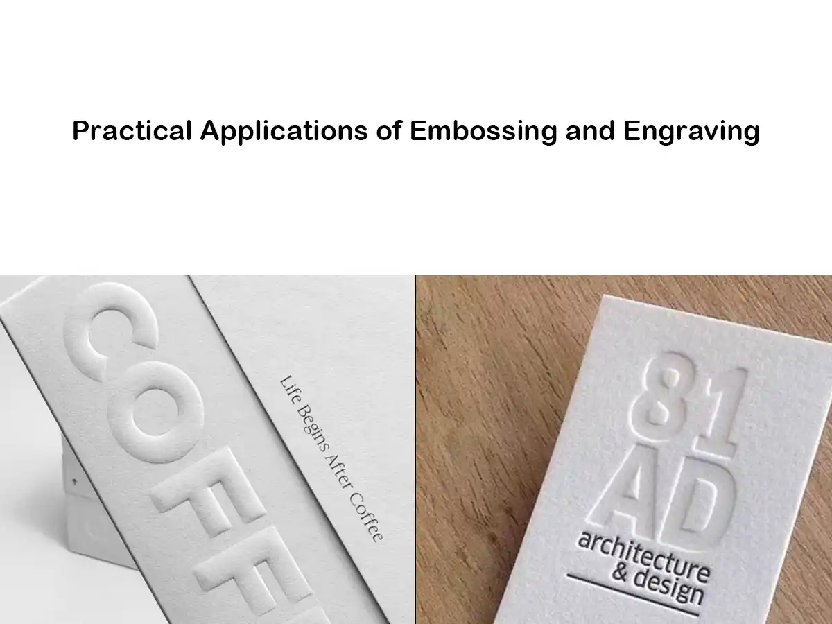
2. What Is Embossing?
Definition
Embossing uses a pair of dies (male and female) to push the paper up, forming a raised logo, text, or pattern. The paper is squeezed between the dies in a press, sometimes with heat added for a crisper relief.
Where it’s used in packaging
On paper boxes, bags, and cards, embossing is commonly applied to:
- Brand logos on rigid gift boxes
- Product names or seals on folding cartons
- Patterns or borders on hang tags and greeting cards
Visual and tactile effect
- Stronger shadows and highlights, especially under side light
- Very noticeable by touch — the design “pops” out of the surface
- Often associated with luxury, celebration, or craftsmanship
Embossing works best when you want the brand to stand out quickly at first glance and under the fingertips.
3. What Is Debossing?
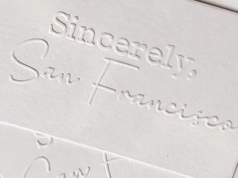
Definition
Debossing uses the same idea but in reverse: the die presses the design down into the paper, creating a sunken effect. The top surface stays mostly flat; the artwork sits in a shallow “valley.”
Where it’s used in packaging
You’ll often see debossing on:
- Minimalist cosmetic or fashion boxes
- Premium envelopes or invitation sets
- Kraft or colored paper bags with a subtle branded mark
Visual and tactile effect
- More understated and calm than embossing
- The design is felt as an indentation rather than a bump
- Works very well with soft, uncoated or textured papers
Debossing is ideal when you want refinement and subtlety instead of a loud, dramatic effect.
4. How the Process Works
Whether you choose embossing or debossing, the basic production steps are similar.
4.1 Dies and setup
- Artwork preparation
- Vector files (AI, PDF, EPS) are preferred.
- Avoid very thin lines and tiny details; they may fill in or break.
- Die making
- A metal die set is produced: one side raised, one side recessed.
- The height and depth depend on the desired relief and paper type.
- Pressing
- Sheets or box blanks are fed into a press.
- The dies close with controlled pressure, sometimes with heat.
- The paper fibers stretch and keep the new shape.
4.2 Paper thickness and type
For a clear, clean relief, thicker paper or paperboard is strongly recommended:
- Many printers like to start around 170–300 gsm and go higher for strong embossing.
- Very thin paper can warp, tear, or show a weak, shallow effect.
- Rigid box boards and heavy card stocks hold deep relief best.
Uncoated or lightly coated boards usually show texture more clearly than very glossy laminated surfaces, which can crack if the pressure is too high.
5. Combining With Other Finishes
Embossing and debossing are often used together with other print finishes to increase contrast.
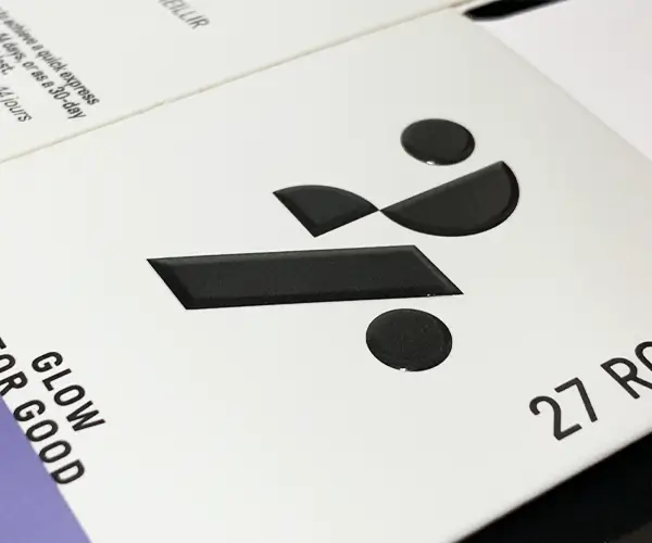
5.1 Foil stamping + embossing (combination embossing)
A common premium choice is to foil stamp and emboss in the same position, sometimes in a single pass. This is often called combination embossing or a combo stamp. It creates a metallic, three-dimensional logo that catches both light and touch.
5.2 Printing + emboss/deboss
- Print the logo or pattern, then emboss or deboss on top to add depth.
- Works well for brand marks, seals, and illustration details.
- Registration (alignment) must be accurate to avoid a “shadow” effect.
5.3 Spot UV + emboss/deboss
- A raised, glossy spot UV next to a matte embossed or debossed area gives strong contrast.
- This is more common on rigid boxes and cards where budget allows extra finishing.
5.4 Blind embossing or debossing
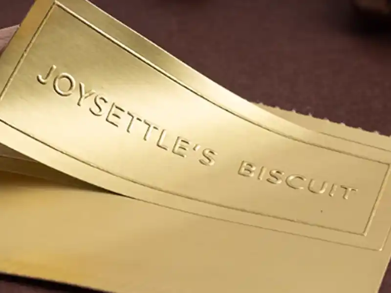
- Blind means no ink and no foil — only the relief.
- Great for minimal, eco, or monochrome designs.
- The look depends heavily on paper color, lighting, and viewing angle.
6. Embossing vs. Debossing: How to Choose
When planning custom packaging, we usually look at four main points.
6.1 Brand style
- Choose embossing if you want:
- A bold, attention-grabbing logo
- Strong highlights and shadow depth
- A “push forward” brand presence
- Choose debossing if you want:
- A quiet, refined, or minimalist look
- A subtle logo that reveals itself on closer inspection
- A sophisticated, book-cover feel
6.2 Product and structure
- Boxes with inner trays or tight fits
- Deep embossing can slightly distort panel flatness.
- Debossing is often safer if the inside must remain perfectly smooth.
- Flat items (cards, hang tags, certificates)
- Both work well; the decision is mostly aesthetic.
6.3 Design complexity
- Very fine text or intricate patterns are harder to emboss or deboss cleanly. Many printers set a minimum stroke and spacing to avoid filling-in and cracking.
- Large solid areas can look uneven if the paper is too thin or soft.
- Try to keep the effect away from folds, perforations, or glued flaps.
6.4 Production risk and cost
- Each new emboss/deboss design requires its own die, so there is a one-time tooling cost.
- The more positions or designs you add, the higher the cost and setup time.
- Misregistration (when print and emboss don’t align) can cause blurred or “ghosted” edges, especially on very tight designs. Good make-ready and realistic tolerances help avoid this.
7. Practical Design Tips & FAQs
7.1 Simple design checklist
Before you send artwork for a paper box, bag, or card:
- Use vector files and clearly mark which areas should be embossed or debossed.
- Keep small text and thin lines to a minimum.
- Confirm the paper weight with your printer; for strong relief, ask about 200 gsm+ for cartons and even heavier boards for rigid boxes.
- Leave enough margin from creases, die-cut edges, and glue flaps.
7.2 Common issues and how to avoid them
- Cracking on coated or laminated paper
- Use a slightly shallower relief or adjust the coating/lamination type.
- Score and fold carefully on heavier boards.
- Weak or uneven relief
- Increase paper thickness or choose a softer, more emboss-friendly stock.
- Check that pressure and heat are set correctly on press.
- Misalignment with printed graphics
- Keep designs simple and allow small tolerances.
- Avoid extremely tight borders or multi-color elements around the emboss area.
7.3 Short FAQs
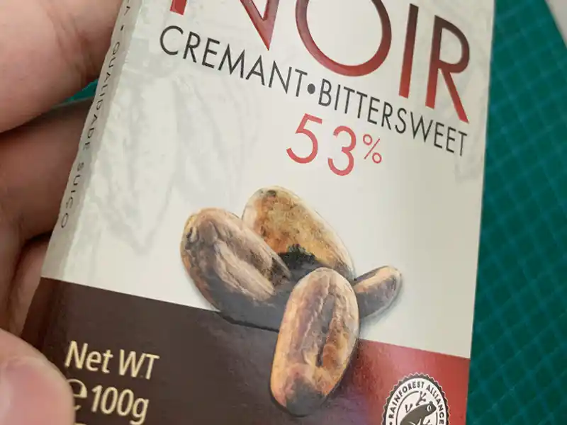
Q1. Can embossing and debossing be used on Kraft or recycled boards?
Yes. Both effects can look very good on Kraft or recycled paper, especially for natural or eco brands. Just note that rough fibers may soften fine details.
Q2. Will the effect weaken the box?
In normal depths, no. The paper fibers stretch but the structure remains sound. Problems only appear if the relief is extremely deep or too close to folds and structural lines.
Q3. What files should I send to my packaging supplier?
Typically:
- Editable vector artwork (AI / PDF / EPS)
- A separate layer or color (often a spot color) indicating the emboss/deboss area
- Clear notes on whether each marked area is embossed (raised) or debossed (recessed) and if it is blind, foiled, or printed.
If you keep one rule in mind, let it be this:
Embossing pushes your design up; debossing presses it down.
From there, the right choice comes from your brand style, the paper you choose, and how much emphasis you want your logo or message to have in the customer’s hand.