1. Introduction: Classic Perfumes in a Fast-Growing Market
The global perfume market keeps expanding. Recent reports estimate its value at around USD 60–61 billion in 2025, with steady growth expected over the next decade. In a market where new launches appear every week, a handful of classic fragrances still dominate counters and gift lists year after year.
In 2025, brands like Chanel, Dior, Tom Ford, Guerlain, and Jo Malone remain at the top of global fragrance sales, supported by long-term hero products rather than one-season trends. Chanel, for example, continues to lead worldwide fragrance revenue thanks to enduring icons such as Chanel No.5 and its modern flankers. Dior holds a top-three position in global fragrance sales, with J’adore as one of its key pillars.
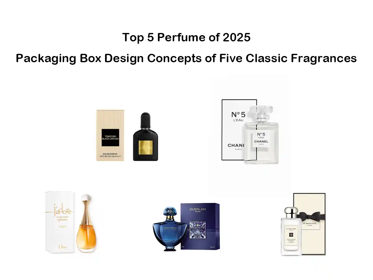
Our focus here is on five classics that still sell strongly in 2025 and what their paper packaging boxes can teach any brand:
- Tom Ford Black Orchid – a gender-fluid, dark floral that has become a modern legend and cult favorite.
- Chanel N°5 L’Eau – a fresher interpretation of the original No.5, part of one of the most popular and best-selling classic fragrance families in the world.
- Dior J’adore – a long-running bestseller often listed among the top-selling women’s perfumes globally.
- Guerlain Shalimar Souffle Intense – an intense flanker of Shalimar, a fragrance that has been in continuous production since 1925 and remains a flagship for Guerlain, selling an estimated 108 bottles per hour as of 2017.
- Jo Malone English Pear & Freesia – described by the brand as its “most loved fruity scent” and consistently listed among its cologne bestsellers.
Their long-term sales performance tells us something important: the combination of scent, bottle, and box builds memory and trust. The paper packaging box is the first thing a shopper touches and often the last thing a gift recipient keeps. For packaging buyers, studying these classics is a shortcut to understanding what works on today’s shelves.
2. What Makes a Successful Luxury Perfume Box in 2025?
Before we look at each perfume, it helps to break down what a strong perfume box usually includes:
- Clear positioning – the box should instantly express whether the scent is dark, fresh, feminine, or minimalist.
- Matched structure and bottle – folding carton vs. rigid box, wall thickness, and internal fit all need to echo the bottle’s weight and silhouette.
- Right paper choice – glossy coated board for a polished, cosmetic look; uncoated or textured paper for a natural, tactile feeling; sometimes specialty metallic or colored board for drama.
- Finishing and decoration – hot foil, embossing/debossing, spot UV, gloss/matte lamination, and sometimes ribbons or sleeves.
- Sustainability – brands increasingly want recyclable mono-material paper structures and FSC-certified boards that still feel luxurious.
All five perfume boxes below combine these elements in different ways. Let’s look at how their style drives their packaging decisions.
3. Tom Ford Black Orchid – Dark Luxury with Vertical Texture
3.1 Fragrance and Market Role
Launched in 2006 as Tom Ford Beauty’s first fragrance, Black Orchid has grown into a modern classic with cult status. Beauty editors still call it a “modern legend” for its bold, sensual character and gender-inclusive appeal. That kind of reputation helps keep the perfume visible in retailers and seasonal gift sets almost twenty years after launch.
3.2 Packaging Box Design
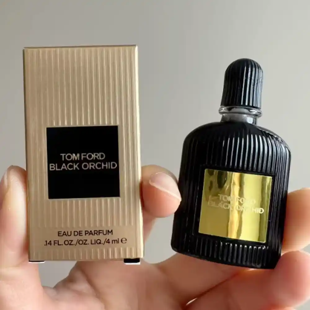
The packaging mirrors this dark, glamorous personality:
- The box uses a vertical ribbed texture, echoing the fluted black bottle. This is usually created with an overall emboss pattern in the board.
- A black central panel with a gold foil logo plate sits on the front, giving a clear focal point.
- Colors stay strict: warm gold + deep black. That limited palette reinforces the luxury image and keeps printing simple but bold.
- For smaller sizes, brands often use a rigid or semi-rigid box so the unboxing still feels weighty and special.
3.3 Design Lessons
For packaging buyers, Black Orchid suggests:
- Use heavy texture embossing if you want a strong tactile memory and you can match the texture to the bottle or brand story.
- Keep the print design minimal when you invest in bold foil and texture. Let the gold logo plaque do the talking.
- Dark colors on paper may need higher-quality inks and proper coating or lamination to avoid scuffing during transport.
4. Chanel N°5 L’Eau – Timeless Minimalism and White Space
4.1 Fragrance and Sales Context
Chanel N°5 L’Eau is the “N°5 of today” – a fresher, lighter version aimed at younger users while remaining part of the famous N°5 family. The original Chanel No.5 has been called the best-selling classic fragrance for many years and remains one of the world’s most recognizable perfumes. Chanel’s strong sales performance in 2025 is still heavily linked to this line.
4.2 Packaging Box Design
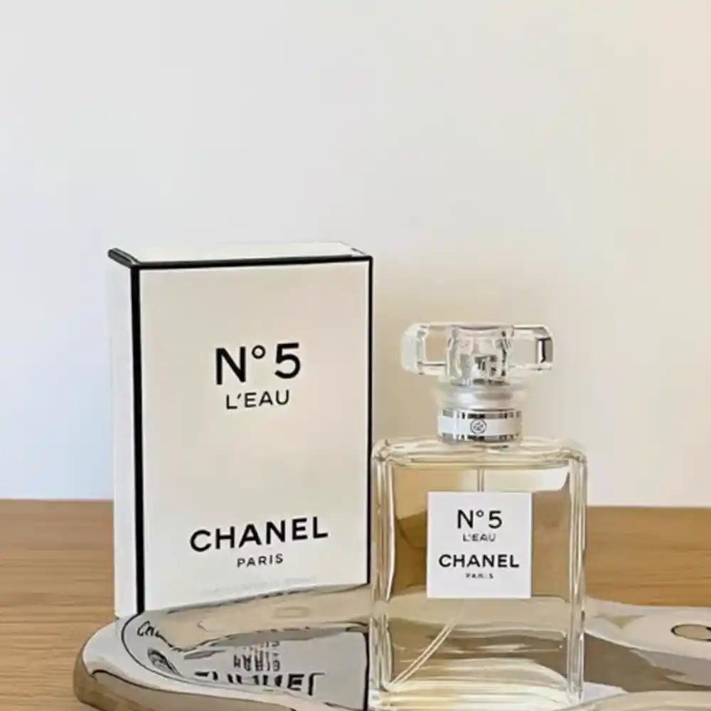
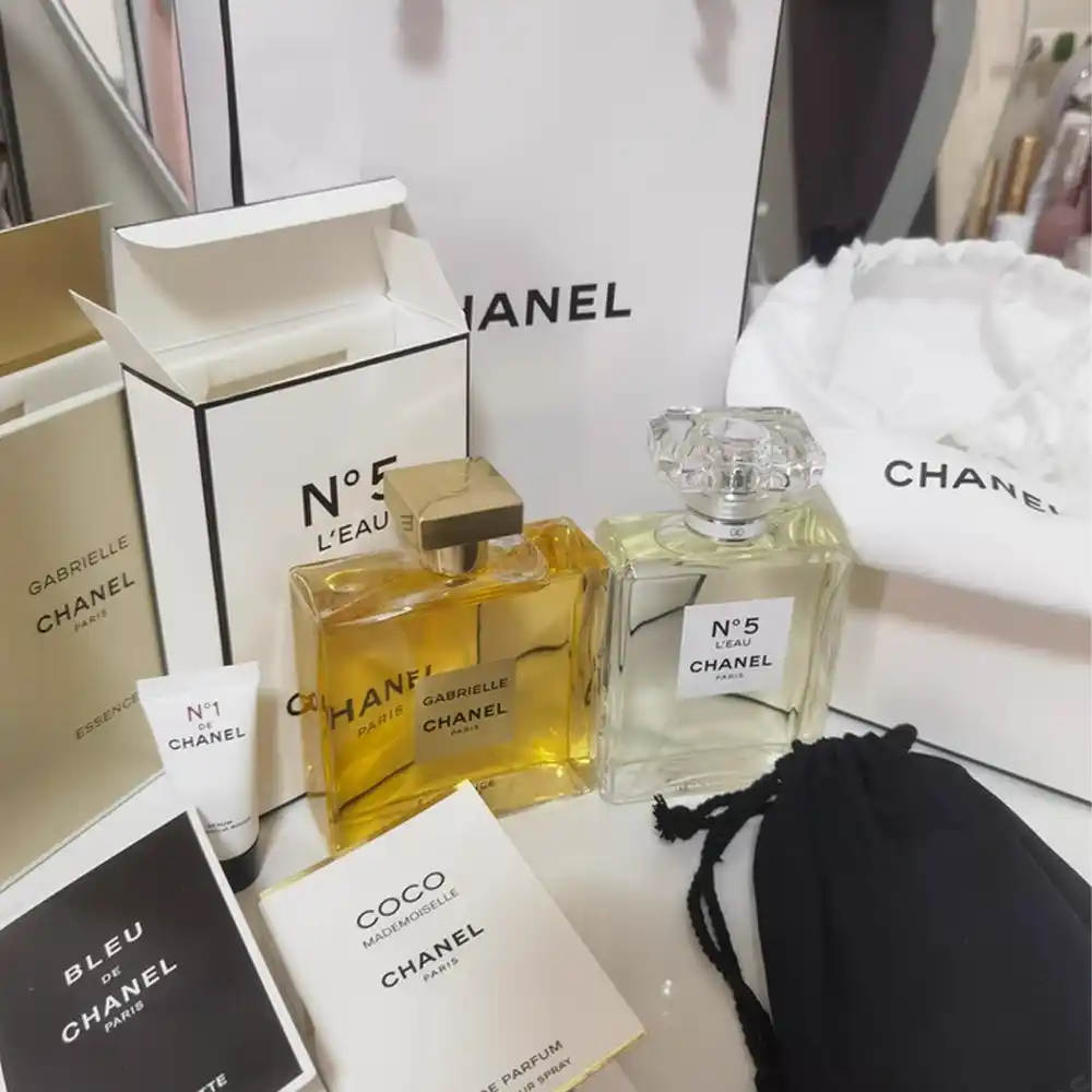
The box design is the visual definition of luxury minimalism:
- Bright white coated board with sharp corners gives a clean, “pharmacy-meets-fashion” look.
- A thin black line runs around the edges of the front panel, framing the central label like a picture.
- Typography is precise and restrained, usually in black sans serif, centered and carefully spaced.
- There are no photos, no large graphics – just logo, product name, and some air.
4.3 Design Lessons
N°5 L’Eau shows that you don’t need complex artwork to feel high-end:
- Invest in high-whiteness, high-smoothness board. On such a minimal design, the paper quality is immediately visible.
- Use negative space strategically. Extra blank area around logo and text can actually raise the perceived value.
- Keep the graphic grid consistent across all sizes and gift sets, so shoppers recognize the product even when the bottle or outer format changes.
5. Dior J’adore – Golden Feminine Silhouette
5.1 Fragrance and Sales Context
J’adore is one of Dior’s pillar women’s fragrances and a long-running bestseller, frequently mentioned among the best-selling perfumes worldwide. The scent is described by Dior as a luminous, floral arrangement of ylang-ylang, rose, and jasmine, housed in an amphora-shaped bottle with a golden “necklace” detail.
5.2 Packaging Box Design
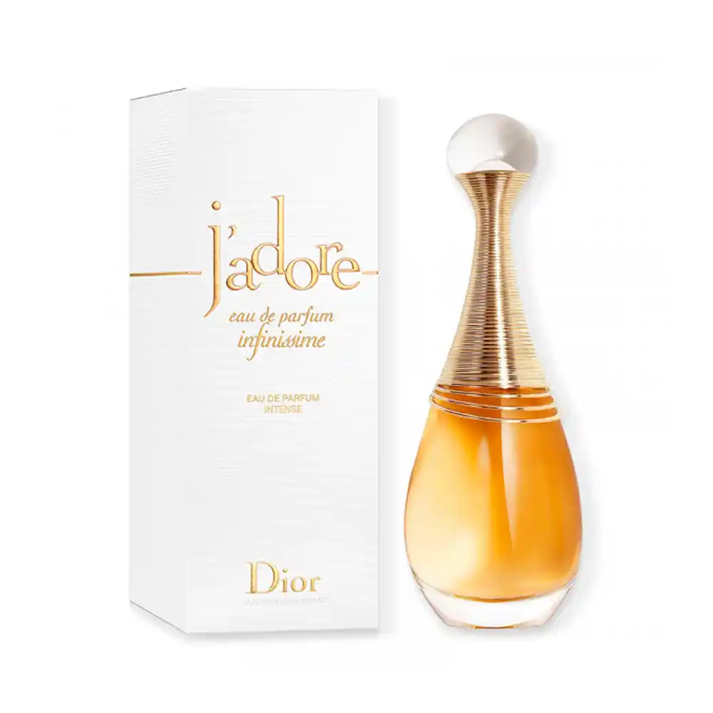
The box continues that golden, feminine story:
- The structure is tall and slim, following the vertical lines of the bottle and its elongated neck.
- The base color is soft white or ivory, often with a subtle satin sheen rather than high gloss.
- The J’adore logo is embossed and hot-stamped with warm gold foil, sometimes with a slight relief so fingers feel it instantly.
- Thin gold rings or lines on the box echo the bottle’s metal collar.
5.3 Design Lessons
From a packaging point of view:
- Think about proportion. A slim box next to a tall bottle creates elegance; a chunky box would fight the message.
- Combine foil + embossing when the brand name itself is central to the design. The shine and depth make the logo memorable even in quick shelf scanning.
- Use warm metallic foil rather than overly yellow or cold gold; this matches skin tones better and feels more “skin-like”, which suits a sensual floral scent.
6. Guerlain Shalimar Souffle Intense – Deep Color and Storytelling Pattern
6.1 Fragrance and Heritage
The Shalimar story is almost a century old. First released in 1925, it is one of the earliest famous amber perfumes and remains a flagship product for Guerlain. Shalimar has shown remarkable staying power: as of 2017 it was reported as Guerlain’s second best-selling fragrance, with around 108 bottles sold every hour.
Shalimar Souffle Intense keeps the rich oriental character but pushes it into a more intense, modern direction, which is mirrored by its darker, more saturated packaging.
6.2 Packaging Box Design
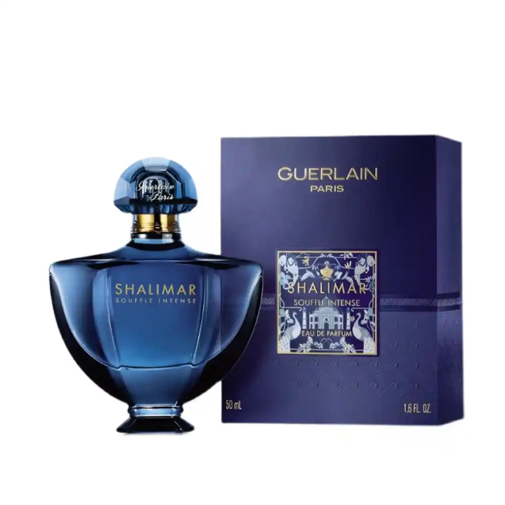
Key design choices:
- The box uses a deep navy or royal blue background, matching the bottle’s jewel-like color. Dark colors instantly signal richness and depth.
- A central rectangular plaque holds the logo and line name, usually in metallic lettering, which pops against the blue.
- Around this plaque, Guerlain often uses ornamental patterns—architectural motifs, florals, or geometric frames—that recall the original Shalimar inspiration and its palace imagery.
- Finishes such as hot foil and spot UV are commonly used on the logo and decorative elements to catch light without overwhelming the design.
6.3 Design Lessons
For anyone planning a dramatic perfume box:
- If you choose a very dark base color, work closely with your printer on ink coverage, potential color shifting, and scratch resistance. Matte lamination plus spot UV can balance richness and durability.
- Use patterns in a controlled area (around a plaque, in a border) rather than over every surface. This keeps the box from feeling too busy while still telling a story.
- Deep colors and detailed artwork pair well with a rigid box or heavy paperboard, so the tactile feel matches the visual density.
7. Jo Malone English Pear & Freesia – Modern, Gift-Ready Simplicity
7.1 Fragrance and Sales Context
English Pear & Freesia is one of Jo Malone London’s signature scents. The brand calls it its “most loved fruity scent” and features it prominently across colognes, body products, and home fragrance. On the brand’s bestseller pages, the cologne regularly appears in the top group of best-selling fragrances.
7.2 Packaging Box Design
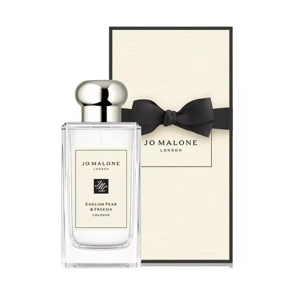
The packaging is deliberately understated and gift-oriented:
- The outer box uses a cream or light beige paper with a slightly textured or uncoated look, which feels more like stationery than cosmetics.
- A thin black border line frames the front panel, with a vertical label in the center showing the logo and fragrance name.
- Many gift versions arrive with a black grosgrain ribbon bow, tied around the box like a present.
- The color palette—cream, black, and a small accent of metallic or logo mark—is calm and modern, fitting the brand’s British, lifestyle-focused image.
7.3 Design Lessons
English Pear & Freesia is a good template for brands that want something minimal but warm:
- Consider uncoated or lightly textured paper instead of high-gloss art paper if your brand leans toward natural, lifestyle, or “home” positioning.
- A simple ribbon or belly band can significantly upgrade perceived value, especially for gifting occasions, without changing the box structure.
- Keep fonts and layout consistent across your full line. Jo Malone’s boxes look almost identical from a distance; the small label change tells the customer which scent they are picking.
8. Key Takeaways: What These Bestsellers Teach About Perfume Box Design
Looking across these five classics, a few common themes appear:
- A clear visual code
- Black + gold ribs for Tom Ford’s dark glamour.
- White box with thin black frame for Chanel’s architectural minimalism.
- Gold accents and slender proportions for Dior’s feminine elegance.
- Deep blue jewel tones and patterns for Guerlain’s oriental heritage.
- Cream paper, black edge, and ribbon for Jo Malone’s soft, gift-ready British style.
- Consistency over decades
Successful lines maintain a coherent box language even when they launch flankers, limited editions, or new sizes. This repetition reinforces recognition and helps justify premium pricing. - Tactile details matter
Embossing, foil, textured papers, and ribbons all invite the hand to touch. That physical interaction builds a sense of quality before the bottle is even seen. - Structure supports the story
Tall, slender boxes for elegant bottles; compact ribbed boxes for dense, powerful scents; rigid boxes for heavy glass. Matching box structure to bottle and brand image avoids visual conflict. - Sustainability is no longer optional
Many luxury brands now look for FSC-certified boards, recyclable mono-material structures, and reduced plastic inserts. You can still keep a premium feel by choosing heavier board weight, better paper texture, and careful finishing rather than plastic platforms.
9. Summary & Practical Checklist for Your Next Perfume Box
Looking at these five classics, one thing is clear: most best-selling perfumes still rely on well-designed folding cardboard boxes as their main outer packaging. Rigid boxes appear more in limited editions and gift sets, but on everyday shelves the hero is usually a carefully printed, cleverly engineered folding carton.
When you plan your own perfume box, you can use this simple checklist:
- Positioning – Write down three keywords for your scent (for example: “dark, unisex, night” or “fresh, minimalist, daytime”).
- Structure – Decide if a folding paperboard box is enough (it usually is for standard retail) or if some SKUs need a rigid gift box.
- Paper & Color – Choose coated vs. uncoated board, texture level, and a core palette of one to three main colors.
- Finishing – Mark where you really need foil, embossing/debossing, spot UV, or soft-touch/matte lamination to create a tactile memory.
- Sustainability – Confirm FSC or other certifications, and try to keep the structure mono-material so it is easy to recycle.
- Line-Up Planning – Check that your design can stretch to different volumes, gift sets, and future flankers without losing recognition.
In short, the perfumes that keep selling year after year all combine three things: a clear scent story, a recognizable bottle, and a folding cardboard box that translates the brand into color, typography, and touch. If you treat the box as part of the fragrance experience—not just protection for shipping—you are already much closer to building a classic.