
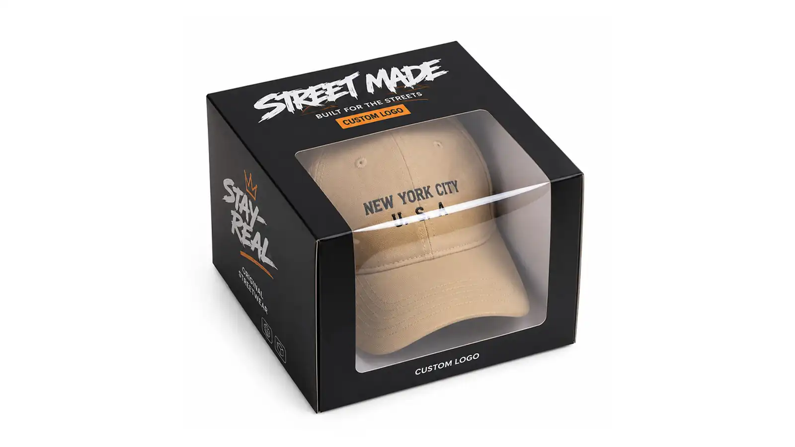
A window hat box lets shoppers see the cap’s color, front embroidery, crown shape, and brim while the package remains closed. For a product chosen partly for its appearance, that visibility gives the box a useful second role: it becomes a small display for the hat inside.
The appeal is especially clear when several caps sit together on a shelf. A consistent box design frames the collection, while the visible caps introduce the different colors and details. Getting that effect right takes more than a large transparent opening. The window, the hat’s position, the printed frame, and the viewing angle need to work together.
The Cap Becomes Part of the Packaging Design
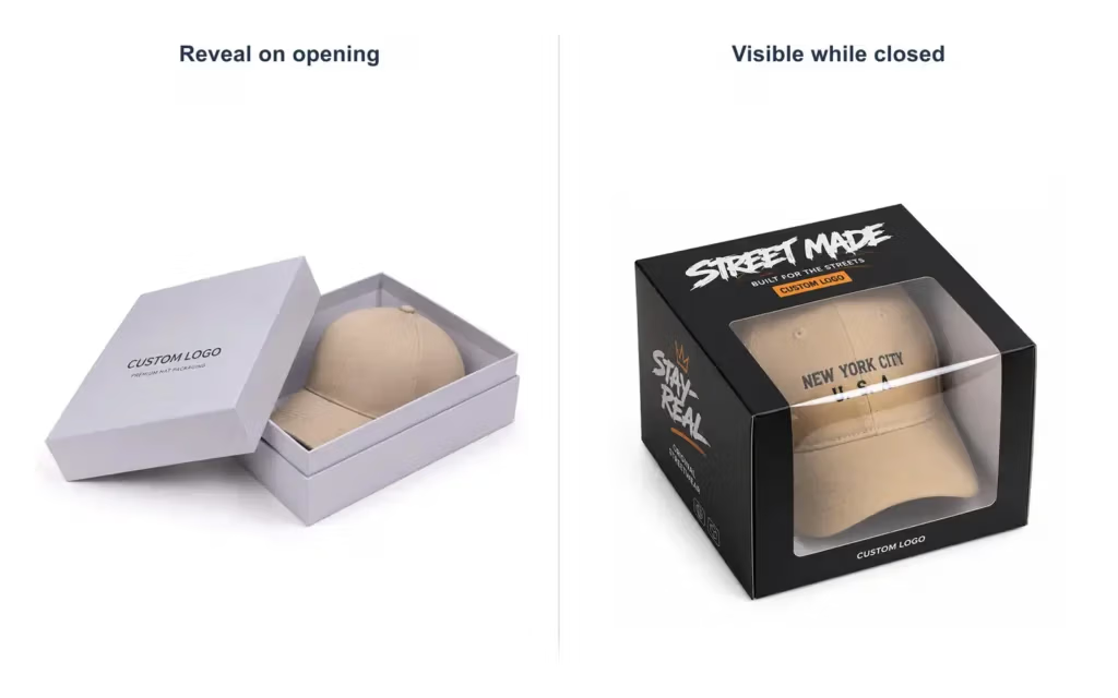
In the gray two-piece box shown below, the separate lid creates a deliberate reveal. Once it is lifted, the cap becomes the focus. With the box closed, the exterior artwork carries the presentation.
The black windowed example brings that reveal forward. Its transparent area extends across the front and top, exposing the cap’s crown, front lettering, and curved brim. The printed panels form a frame around the product, combining the box’s graphic identity with the cap’s own appearance.
These are two different presentation approaches. One emphasizes the moment of opening; the other lets the product remain visible throughout browsing.
For brands exploring this packaging direction, the practical opportunity is clear: show the features customers are choosing the cap for, and give those features a deliberate place in the package design.
What Makes a Window Hat Box Look Good on a Shelf?
Frame the feature shoppers should notice first
Start with the cap. For an embroidered design, the opening should frame the front panel without cutting through the main artwork. For a two-tone cap, show enough of both crown and brim to communicate the color combination. If the main feature is a side patch, the display orientation may need to change.
Keep the surrounding graphics in proportion. A clear brand name and a short collection label can give the box identity while leaving room for the product. When large slogans, patterns, and visible embroidery all compete for the same space, the presentation can become difficult to read.
This is a practical application of designing branded packaging beyond printing: structure and product placement contribute directly to what the customer sees.
Design a row of boxes as well as a single pack
Imagine beige, navy, and olive caps displayed in the same dark box. Consistent window positions and aligned branding can hold the row together visually, while the caps provide the variation. A lighter interior may help a dark cap remain visible; the best background depends on the actual range.
Check the whole assortment before committing to one design. A window that works for a tall, structured crown may leave an unstructured cap sitting too low. Different supports may be needed even when the outer boxes share dimensions.
Shelf space matters too. Extra empty space around the cap increases the package footprint and can reduce the number of front-facing packs that fit. Size the box around the supported hat and required clearance, then assess the full row on the intended fixture.
Check the view under store lighting
A clear window can reflect ceiling lights, shelf lighting, and nearby bright surfaces. That reflection may run directly across the embroidery from one viewing angle, even when the product looks clear in a studio image.
Review a packed sample at the intended shelf height and from the shopper’s approach direction. Look for glare, haze, wrinkles, visible adhesive, and scuffing after normal handling. Put size and price labels where they can be read without covering the main product feature.
Should the Window Be on the Front, Top, or Both?
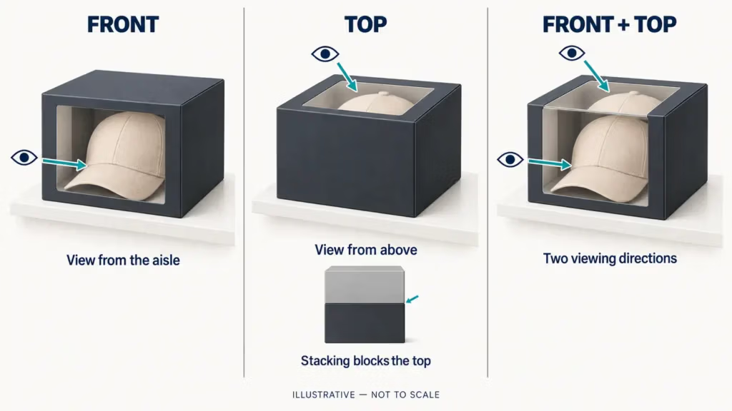
Window placement should follow how the box will be displayed. A top window can work well when a shopper looks down onto a counter, but may contribute little when another box sits directly above it.
| Window position | Display situation to evaluate | Main design check |
|---|---|---|
| Front | Packs presented upright toward the aisle | Keep the cap’s main feature visible above the shelf edge or price rail |
| Top | Countertop displays or lower shelves viewed from above | Check whether the shelf above, another pack, or glare blocks the view |
| Front and top | Displays viewed both straight on and from above | Review the window transition, remaining board frame, and both sightlines |
The black example illustrates why a front-and-top window is appealing: the cap can be seen across two faces of the box. The usable view still depends on the hat’s orientation and the surrounding display. A larger transparent area is only helpful where it reveals something worth seeing.
For a window crossing a fold, the converter also needs to assess how the transparent material bends and attaches to the board. The visible corner should remain clean when the box is assembled and handled. Review that detail on the finished prototype.
Keep the Hat in the Position the Window Was Designed For
The insert is part of the display. If the cap rotates, drops, or presses against the window, the carefully planned view changes.
Develop the support around an actual cap sample. A shaped paperboard cradle, crown support, or another fitted arrangement can be considered to hold the front panel toward the viewer while respecting the brim’s intended curve. Leave enough clearance for the crown and top button, and keep support edges away from areas where they could leave marks.
Test every cap style intended for the pack. A flat-brim fitted cap, a curved-brim cap, and a soft dad hat may need different positioning. The insert should also allow store staff or customers to remove and replace the cap without struggling with the box.
A window makes internal presentation visible all the time. Loose tissue, untidy tags, or an exposed support tab therefore deserve the same attention as the printed exterior.
Balance the Display With Structure and Material Choices
A window removes part of the board panel. The remaining frame, corners, folds, and closure must provide the required support. Cutting away more material can affect stiffness and stacking performance, so the opening needs to be developed with the structure.
Custom folding cartons are one route for retail cap packaging. Rigid constructions may suit a different presentation brief. In either case, assess the packed box and any outer shipping carton together, particularly if the windowed pack will travel through parcel delivery before reaching the shelf.
Specify the transparent material by its required clarity, flexibility, surface durability, and compatibility with the attachment method. The supplied image alone cannot identify its material. A covered window creates a barrier to direct contact through the opening, but the complete box should not be assumed to be sealed or dustproof.
For environmental claims, check the board, window, adhesive, finish, and insert as a complete package. Cepi’s paper-packaging recyclability guidance explains that combining paper with other materials can complicate recycling and that the destination market’s system matters. Confirm the appropriate disposal instructions for the selected construction.
For quotations, compare equivalent pack sizes and support requirements. Window cutting, the transparent patch, attachment, assembly, and inspection are cost items to confirm with the supplier. Ask whether a smaller opening would deliver the same useful view with a simpler structure.
When an Opaque Hat Box Is a Better Fit
An opaque two-piece presentation box can be a strong choice when the main experience is gifting and opening. It provides uninterrupted space for artwork and creates a reveal when the lid is removed. In a store where customers try a separate sample and receive a fresh boxed cap, continuous visibility through every pack may add less value.
Windowed packaging is particularly worth evaluating when customers browse boxed caps by color, embroidery, or design. An open cap display also remains useful where touching the fabric and trying the hat are central to shopping; a window cannot provide those interactions.
Window placement and box construction are separate choices. A window can be incorporated into a suitable lid-and-base design, and a folding carton can be fully opaque. The two pictured examples illustrate presentation options rather than a rule that one structure must always have a window.
Approve the Packaging on the Shelf
Before ordering, review a filled physical sample in the setting where it will be sold:
- Place several packs together. Check alignment, color combinations, shelf footprint, and how the row looks when one pack is removed.
- View them from normal browsing positions. Confirm that the cap’s main feature remains visible past shelf edges, adjacent packs, and lighting reflections.
- Handle the pack. Lift, turn, open, and close it, then check whether the cap and support remain correctly positioned.
- Review the window closely. Check attachment, clarity, corner appearance, and visible marks after handling.
- Evaluate protection for the intended route. Agree appropriate stacking and transport checks using the complete packed configuration.
- Confirm practical details. Check size labels, barcodes, opening instructions, and any material-separation guidance.
If higher sales are a project objective, compare the new pack with the existing presentation under similar store conditions. Visual appeal is a reason to test the design; the commercial result needs its own evidence.
To discuss a custom window hat box, share a cap sample or accurate dimensions, the feature that should face the shopper, the intended shelf arrangement, order quantity, and delivery destination with SLD Packing. These details give the packaging brief a clear target: a cap that is easy to see, properly supported, and presented consistently across the collection.