How to Make Branded Packaging Stand Out Beyond Printing
Printing gives packaging its color, imagery, and written message, but it is only one part of the brand experience. Packaging becomes more distinctive when print works together with surface finish, texture, structure, opening style, and the way the product is presented inside.
The goal is not to add every available effect. It is to decide what customers should notice, feel, and do—and then give each packaging feature a clear job.
Branded Packaging Works on More Than One Level
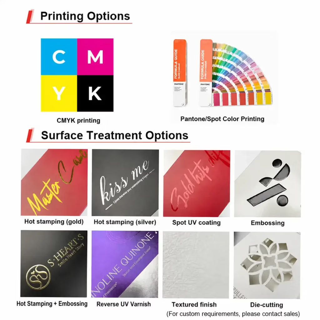
CMYK and Pantone spot colors form the visual foundation of many branded paper boxes and bags. CMYK is well suited to photographs, illustrations, gradients, and multicolor artwork. Pantone colors are often chosen when a specific brand color or a solid color area needs closer control. SLD Packing’s guide to CMYK and Pantone colors for packaging explains this choice in more detail.
Print answers, “What should the customer see?” The decisions beyond print answer several other questions:
- What should catch the light?
- What should be felt under the fingertips?
- How should the package open?
- How should the product be revealed and held in place?
- Which areas need protection from handling?
That is why two packages with similar artwork can feel completely different in person.
| Packaging layer | What it controls | Typical options |
|---|---|---|
| Visual | Color, imagery, information, and hierarchy | CMYK, Pantone, inside printing |
| Surface | Shine, texture, relief, and touch | Foil, embossing, spot UV, lamination, textured paper |
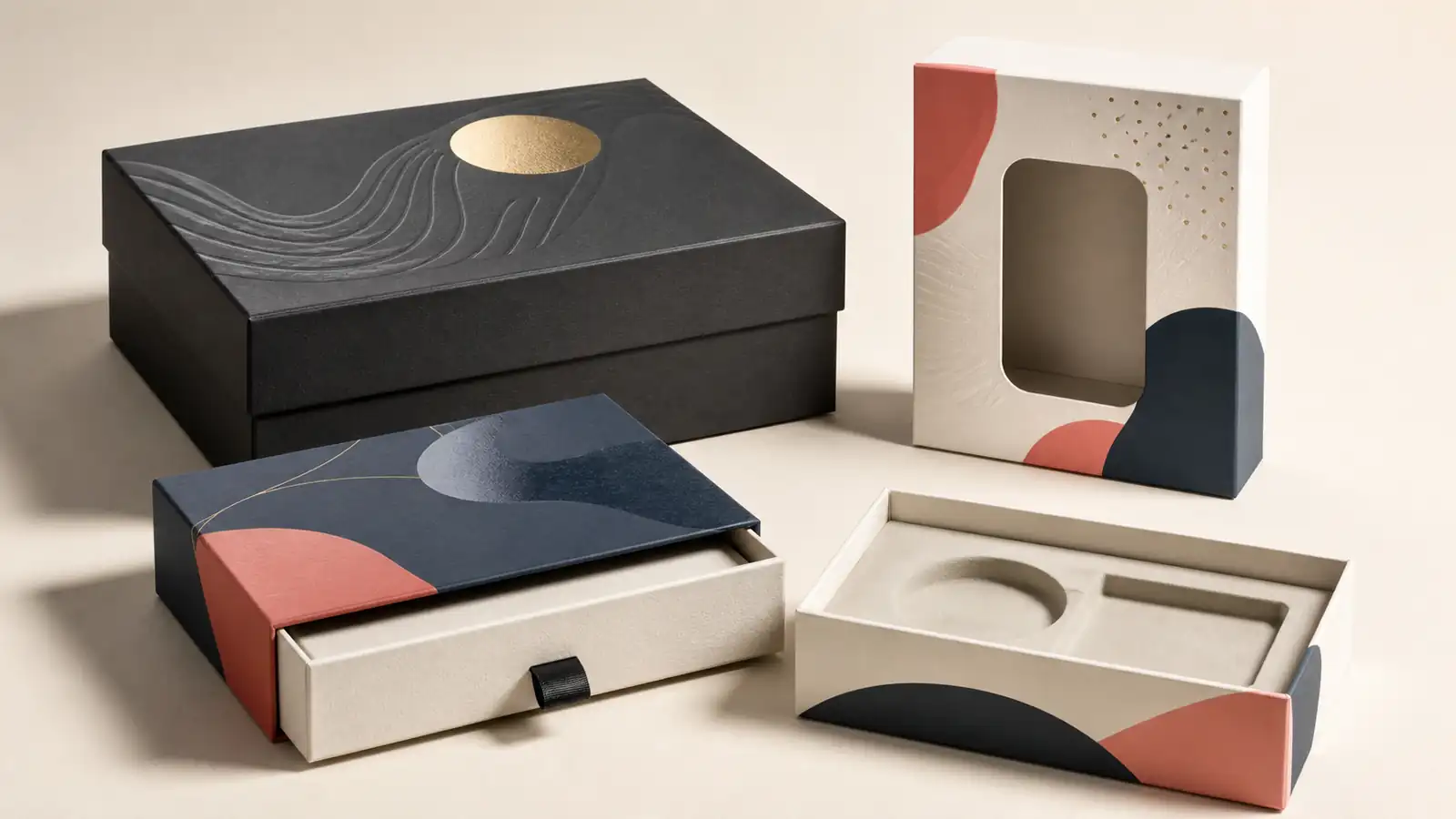
| Structural | Shape, opening action, product visibility | Drawer, lid-and-base, magnetic closure, mailer, die-cut window |
| Internal | Product fit, protection, and reveal sequence | Paperboard, foam, or molded-pulp inserts |
Seven Ways to Build Brand Packaging Beyond Ink
1. Use foil stamping to create a focal point
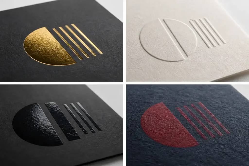
Foil stamping transfers a foil layer to the packaging with a die, heat, and pressure. Metallic gold and silver are familiar, but pigment, matte, and holographic foils can create very different brand signals.
Foil is most effective when it establishes hierarchy. A small reflective logo on a quiet background can have more impact than several large foil areas. It is also useful when the design requires reflectivity that ordinary ink cannot reproduce. Fine lines, crowded details, and uneven surfaces should be reviewed with the supplier before the artwork is approved.
For process and foil-type details, read the beginner’s guide to hot stamping.
2. Add a tactile cue with embossing or debossing
Embossing raises a design above the surface; debossing presses it into the surface. Both allow a customer to recognize a mark through touch as well as sight.
An embossed logo usually feels more prominent. A debossed or blind-debossed mark can support a quieter, minimal identity, particularly on uncoated or textured paper. Large, clear forms generally translate more reliably than tiny type or intricate lines. The material, depth, die, and position relative to folds all influence the result.
SLD Packing’s guide to embossing and debossing for paper packaging covers the main differences and artwork considerations.
3. Create controlled contrast with spot UV
Spot UV applies a cured coating to selected areas, commonly producing a glossy highlight against a matte background. It can draw attention to a product name, icon, pattern, or part of an illustration without introducing another color.
Reverse UV creates contrasting surface effects across different areas, such as a glossy metallic area beside a matte or textured one. Both approaches depend on restraint. If every area reflects light, the intended focal point disappears. Clearly identify all treated areas in a separate varnish layer in the production artwork.
See the guides to spot UV in paper packaging and reverse UV on metallic cardstock for closer examples.
4. Let the base surface set the mood
The finish across the whole package affects every printed and decorative element placed over it. Gloss lamination can increase shine and visual intensity. Matte, anti-scratch, or soft-touch films create different levels of sheen and hand feel. Textured or uncoated papers can communicate warmth, craft, or restraint without another decorative process.
Choose the base surface before finalizing smaller effects. Gloss spot treatment needs contrast around it; foil behaves differently on smooth and textured stock; dark matte packages may need testing for visible fingerprints, rub marks, or scratches. Use the paper box lamination guide to compare common options.
5. Use die-cutting to change shape or reveal the product
Die-cutting can create a custom edge, opening, handle, decorative cutout, or product window. Unlike another layer of graphics, it changes the package silhouette or lets the product become part of the visual design.
A window can help when product color, texture, or detail supports the sale. A custom opening can also guide how the customer handles the pack. However, every removed area affects strength, dust protection, and the space available for required information. The cut line should therefore be developed with the box structure rather than added after the artwork is finished.
6. Make the box structure part of the identity
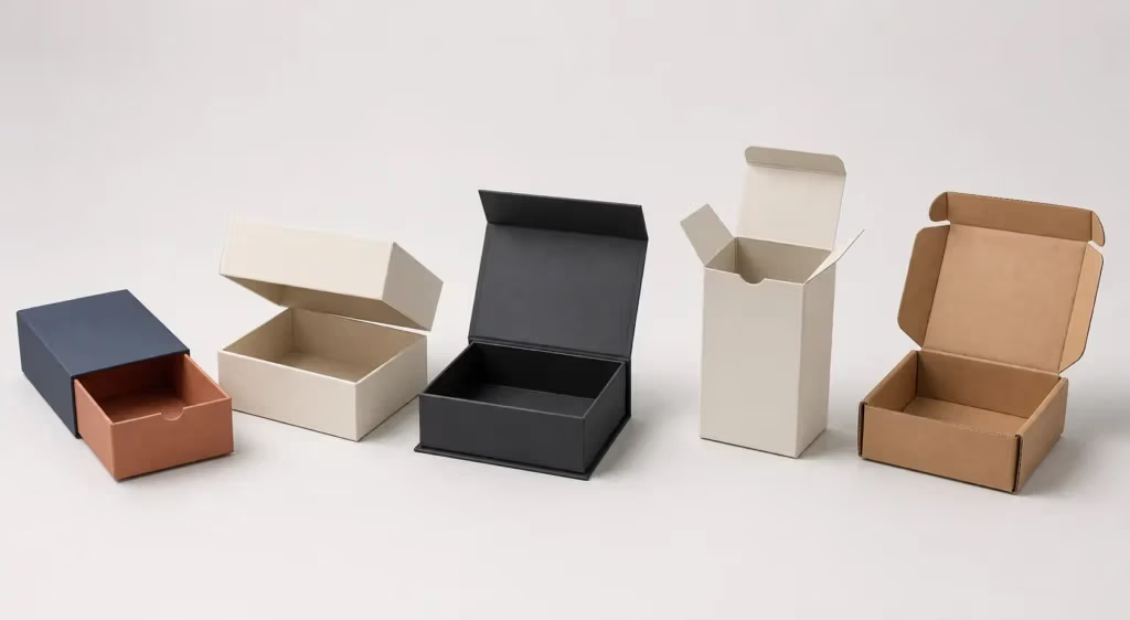
Structure determines the first physical interaction with the brand. A drawer box creates a staged reveal. A two-piece rigid box separates lid and base. A magnetic box gives a controlled closing action. A folding carton is lightweight and adaptable, while a mailer can combine shipment protection with an inside reveal.
Choose the structure around the product and sales route, not appearance alone. Retail display, gifting, storage, direct-to-consumer shipping, and repeated use create different requirements. SLD Packing provides guidance across custom packaging styles and services, including rigid boxes, folding cartons, and mailers.
7. Design the inside, not only the outside
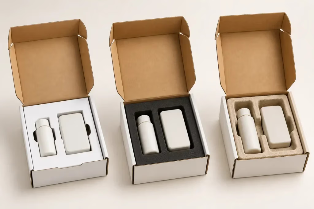
An insert controls where the product sits, what the customer sees first, and whether accessories feel organized or loose. It can also reduce product movement during handling and make a multipiece set easier to understand.
Possible options include paperboard, foam, and molded pulp, depending on the product, presentation goal, and project requirements. Inserts should be developed from actual product dimensions and tolerances. If recyclability or easy material separation is important, discuss the insert, window, lamination, and adhesives as one packaging system rather than assessing only the outer box.
Match the Finish to the Brand Message
The combinations below are starting points rather than fixed formulas. A physical sample is the best way to judge whether a finish supports the intended identity.
| Brand direction | Possible packaging combination | Why it can work |
|---|---|---|
| Quiet luxury | Restrained Pantone color, matte surface, blind embossing | Uses touch and shadow instead of heavy decoration |
| High-contrast premium | Dark base, metallic foil logo, selective embossing | Creates a clear focal point with light and relief |
| Modern or technical | Clean CMYK/Pantone artwork, matte base, gloss spot UV | Adds controlled contrast without changing the color palette |
| Natural or craft-led | Textured or uncoated paper, limited ink, debossed mark | Lets material and touch carry more of the identity |
| Retail product reveal | Die-cut window, simple print, fitted insert | Makes the product part of the shelf presentation |
| E-commerce unboxing | Durable mailer, inside print, organized insert | Connects protection with a deliberate reveal sequence |
One strong “hero” detail is often more memorable than several unrelated effects. If foil already creates the focal point, for example, spot UV and embossing should support that hierarchy rather than compete with it.
Build the Packaging Specification in the Right Order
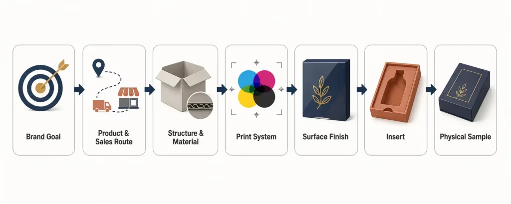
1. Define the main job
Choose one priority: shelf visibility, premium presentation, tactile recognition, shipping protection, product visibility, easy setup, storage efficiency, or material simplicity. Secondary goals can follow, but the main job should guide trade-offs.
2. Map the customer interaction
Consider how the customer encounters the package—from a distance, on a shelf, in a shipping carton, in hand, and during opening. Use color and contrast for distance, texture and relief for close handling, and structure and inserts for the reveal.
3. Select structure and material
Product size, weight, fragility, paper texture, board thickness, folds, wrapped edges, glue areas, and window placement all affect which finishes are practical. A treatment that looks clean on a flat sample card may behave differently near a crease or wrapped edge.
4. Give every finish a job
Mark exactly where foil, embossing, UV, texture, or cutouts will appear and state what each feature should emphasize. This makes it easier to remove decoration that adds cost without improving the experience.
5. Prepare production artwork
Supply editable artwork where possible and separate the CMYK/Pantone artwork, foil mask, embossing or debossing layer, UV mask, window, and cut line. Confirm minimum detail, clearance, and registration requirements with the supplier rather than assuming the same tolerance for every process.
6. Review a physical proof or sample
Screens cannot show reflectivity, relief, friction, opening resistance, or how a surface changes under different light. For projects involving critical color, several registered effects, a new structure, or a fitted insert, agree on the appropriate proof or prototype before mass production.
Common Mistakes to Avoid
- Adding every premium effect: Too many reflective, raised, glossy, and textured areas weaken visual hierarchy.
- Choosing the finish before the substrate: Paper and coating choices influence color, adhesion, sharpness, and touch.
- Using artwork that is too fine: Small type and thin lines may not suit foil dies, embossing dies, or die-cut shapes.
- Ignoring production zones: Creases, wrapped edges, glue flaps, and cut lines need appropriate clearance.
- Approving only a digital mockup: A render can confirm layout, but it cannot confirm the physical result.
- Treating sustainability as one material claim: Coatings, films, windows, adhesives, and inserts can change how the complete pack is handled after use. Confirm requirements for the destination market.
What to Include in a Packaging Quote Brief
A clear brief helps the supplier recommend compatible processes and ensures that quotations are based on the same specification. Include:
- Product dimensions, weight, and fragile or protruding parts.
- Preferred box or bag style—or the required use case if the structure is undecided.
- Order quantity and delivery destination.
- Editable brand artwork where available.
- CMYK and Pantone references, including critical brand colors.
- Separate, labeled layers for foil, embossing, spot UV, windows, and cut lines.
- Insert requirements and every accessory that must fit inside.
- The main project priority: appearance, protection, cost, setup speed, storage, or material choice.
- Required proof, prototype, testing, and approval steps.
When you are ready to compare options, share these details with SLD Packing’s packaging team. The team can help match the box style, printing, surface treatment, and insert to the product instead of treating each decision in isolation.
Frequently Asked Questions
Can packaging look premium without gold or silver foil?
Yes. Blind embossing, debossing, textured paper, controlled matte-and-gloss contrast, precise structure, and a well-designed insert can all create a premium result without metallic foil. The result comes from the coherence and execution of the whole package, not one material.
Is embossing better than spot UV?
Neither is universally better. Embossing changes surface relief and is noticed through touch and shadow. Spot UV creates gloss contrast and is noticed through reflected light. Choose embossing for a tactile cue, spot UV for a visual highlight, or combine them only when the design and registration requirements justify it.
Can several packaging finishes be combined?
Yes. Common combinations include foil with embossing or spot UV over a matte surface. Compatibility depends on the substrate, coating sequence, artwork, tolerances, and box construction. Request a sample when several processes must align precisely.
Do special finishes affect cost and production time?
They can. Custom dies, setup, extra production passes, registration requirements, and inspection needs may affect both. The impact varies by design, coverage, quantity, and packaging type, so confirm it against the final specification rather than relying on a generic estimate.